- Design Ideas
- Cities
- Trends
- Guides
- Price Calculators
- Interior DesignersNEW
- Our Portfolio
- More
- Home
- Trends
- Furniture And Decor
- Paint And Color
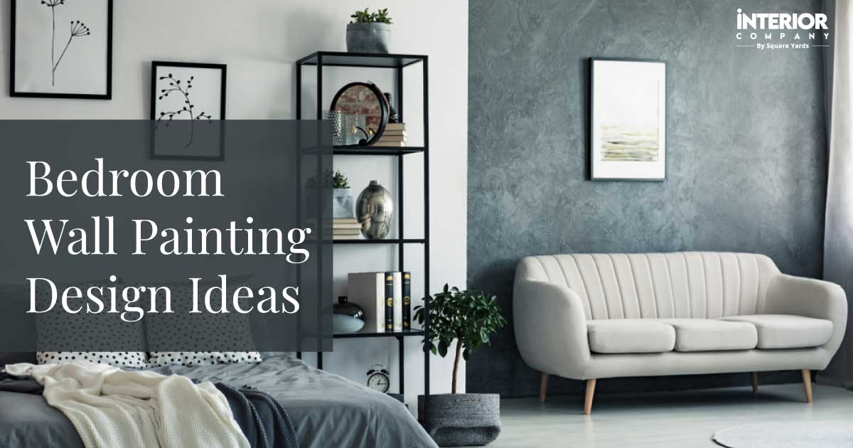
- Bedroom Wall Colour Combinations
Bedroom Wall Colour Combinations That Make Your Mornings Refreshing and Cheerful

Making your bedroom a great place to rest starts with the perfect bedroom wall colour combination. Using two-colour combinations for bedroom walls is the best and easiest way to make your room look pleasing and more stylish, which also helps you sleep better. People love pairings like blue & white, grey & yellow, and lavender & cream because they quickly make the room feel balanced and calm. These colours are great for modern Indian bedrooms. The right colour combination inside the room can make your room feel brighter by using the natural light well.
Table of Content
Painting Your Way to Better Sleep
How to Choose the Right Bedroom Wall Colour Combination?
Best Bedroom Wall Colour Combinations
- 3.1 Blue and White: Classic Bedroom Wall Colour Combination
- 3.2 Lavender and Cream: Relaxing and Romantic Bedroom Wall Colour Combination
- 3.3 Grey and Yellow: Modern and Cheerful Bedroom Wall Colour Combination
- 3.4 Peach and Ivory: Warm and Cosy Bedroom Wall Colour Combination
- 3.5 Mint Green and White: Fresh and Rejuvenating Bedroom Wall Colour Combination
- 3.6 Teal and Grey: Luxurious and Sophisticated Bedroom Wall Colour Combination
- 3.7 Beige and Brown: Earthy and Grounded Bedroom Colour Combination
- 3.8 Pink and Grey: Soft and Modern Bedroom Colour Combination
- 3.9 Olive and Cream: Natural and Restful Bedroom Colour Combination
- 3.10 Navy and Sandstone: Bold and Dramatic Bedroom Wall Colour Combination
- 3.11 Best Bedroom Wall Colour Combinations (Quick Comparison Table)
Trending Bedroom Colour Combination Themes
Two-Colour Combination Patterns
Room-Size Based Colour Selection
Bedroom Colour Psychology Guide
Top Paint Brand Recommendations
Common Mistakes to Avoid
To choose your best colours, just think about the room size, how much natural light you get, and what kind of feeling you want, like a cosy or relaxing space. Read this blog to get an idea of how to paint your bedroom walls.

Painting Your Way to Better Sleep

The colours you choose for your bedroom walls play a significant role in how you feel when you wake up and when you go to sleep.
- Importance of Bedroom Colours: A calming colour palette can significantly improve your sleep quality and reduce stress. A poorly chosen colour (like a bright, harsh red) can make the room feel restless and irritating.
- Colour Psychology of Restful Interiors: Colours like blue and green are proven to be calming, as they remind us of the sky and nature. Soft neutrals like beige and grey create a sense of security and stability.
- Why Two-Colour Combinations Outperform Single Colours: Using two colours adds depth, interest, and dimension. One colour acts as the main background, and the other is a subtle or bold accent, creating a more professional and well-designed look.
- 2026 Bedroom Colour Trends: The focus is on soft, earthy tones (think warm greens and muted terracotta) and sophisticated dual-tone neutrals (light grey paired with a darker charcoal).
How to Choose the Right Bedroom Wall Colour Combination?

Don’t just pick colours you like! The perfect combination depends on the specifics of your room.
- Room Size & Ceiling Height: Lighter, cool colours (like light blue) make small rooms look bigger. Darker colours work best in large rooms or on low ceilings to add cosiness.
Tip: Always use the lighter shade on the largest walls. - Natural vs. Artificial Lighting: North-facing rooms (less light) need warm colours to prevent them from looking dull. Bright, sunny rooms can handle cooler tones.
Tip: Test paint samples in both natural daylight and at night under your lamps. - Furniture Finish: Match the wall colour to the undertone of your furniture. For dark wood, use cream or light sage. For white/pastel furniture, use a contrasting dark or medium-tone colour.
Tip: Avoid matching the wall colour to your bed frame exactly. - Flooring Undertones: Your flooring (tile, wood, or carpet) has an undertone. Cool walls (blue, grey) generally look better with cool-toned flooring.
Tip: A neutral wall colour works with almost any floor. - Warm vs. Cool Palette: Warm colours (reds, yellows, oranges) evoke a sense of cosiness and energy. Cool colours (blues, greens, violets) feel calming and expansive. Bedrooms are generally best with cool or neutral palettes.
Tip: Mix warm (accents) and cool (main) tones for balance. - Finish (Matte vs. Satin): Matte/Velvet is the best choice for bedrooms; it hides imperfections and offers a soft, rich look. Satin/Semi-gloss is highly durable and easy to clean, best for kids' rooms.
Tip: Stick to Matte for the most elegant, restful look.
Bedroom Finish Selection Table
The paint Finish affects durability, washability, and how light reflects off your walls.
|
Finish |
Best For |
Pros |
Cons |
|
Matte |
General Bedrooms |
Provides a soft look and hides flaws well. |
Not scrubbable; difficult to clean. |
|
Velvet Matte |
Premium rooms |
Offers a luxurious, elegant texture. |
Slightly pricier than standard matte. |
|
Satin |
Kids rooms |
Highly washable and durable. |
Has a mild sheen that can highlight surface imperfections. |
|
Royale Luxury |
Master rooms |
Provides the smoothest finish possible. |
Requires good prep (surface must be flawless). |
Best Bedroom Wall Colour Combinations

These are the most popular and time-tested two-colour combinations that work beautifully in any home.
Blue and White: Classic Bedroom Wall Colour Combination

The classic combination for calmness and cleanliness. Use a soft sky blue on three walls and crisp white on the ceiling and trim.
Lavender and Cream: Relaxing and Romantic Bedroom Wall Colour Combination

Use lavender on the accent wall (behind the bed) with a creamy off-white on the others.
Grey and Yellow: Modern and Cheerful Bedroom Wall Colour Combination

The grey offers sophistication, and the yellow adds a pop of energy. Use pale grey as the dominant colour and soft, muted mustard yellow for the accent wall.
Peach and Ivory: Warm and Cosy Bedroom Wall Colour Combination

Use soft peach on all walls, with bright ivory on the ceiling and a simple horizontal stripe below the picture rail.
Mint Green and White: Fresh and Rejuvenating Bedroom Wall Colour Combination

Looks great in a small room. Use mint green on the wall opposite the window, and white on all others to maximise light.
Teal and Grey: Luxurious and Sophisticated Bedroom Wall Colour Combination

A deeper, modern choice. Use deep teal on the headboard wall, paired with a medium-light slate grey on the remaining walls.
Beige and Brown: Earthy and Grounded Bedroom Colour Combination

Creates a warm, natural feel. Use creamy beige as the main colour, with a rich chocolate brown as a deep vertical stripe.
Pink and Grey: Soft and Modern Bedroom Colour Combination

The grey prevents the pink from looking too childish. Use a soft blush pink for the main wall, with a light silver-grey on the rest.
Olive and Cream: Natural and Restful Bedroom Colour Combination

A trendy, sophisticated green. Use olive green for the main walls, balanced by a pure cream on the trim and ceiling.
Navy and Sandstone: Bold and Dramatic Bedroom Wall Colour Combination

A luxurious combination for a large space. Use navy blue on the headboard wall for drama, and light sandstone beige on the remaining walls.
Best Bedroom Wall Colour Combinations (Quick Comparison Table)
|
Combination |
Tone |
Why It Works |
Best For |
|
Blue + White |
Cool |
Creates a sense of Calm and a spacious feel. |
Small bedrooms |
|
Peach + Ivory |
Warm |
Promotes a Cozy and romantic atmosphere. |
Master rooms |
|
Grey + Yellow |
Neutral + Warm |
Looks Modern and introduces a bright, Energetic contrast. |
Youth rooms |
|
Lavender + Cream |
Cool |
It is soothing and adds an elegant touch. |
Restful bedrooms |
|
Mint Green + White |
Cool |
Feels fresh and clean. |
Contemporary rooms |
|
Teal + Grey |
Deep cool |
Provides a luxe, modern and deep feel. |
Large bedrooms |
|
Beige + Brown |
Warm |
Creates an earthy and Cozy atmosphere. |
Traditional interiors |
|
Pink + Grey |
Soft |
Offers a balanced and aesthetic look. |
Couple rooms |
Trending Bedroom Colour Combination Themes

Here are some of the trending wall colour combinations for your master bedrooms.
Minimalist Neutral Palette
Focuses on varying shades of one colour, such as off-white, light beige, and warm grey, to create a subtle but deep look.
Neutral Bedroom Palette (Quick Comparison Table)
|
Colour |
Shade Name |
HEX |
Works With |
|
Soft White |
AP ' White Luster |
#F7F7F2 |
All colours (ideal trim) |
|
Warm Beige |
Berger ' Cane Beige |
#E5D3B3 |
Browns, teals |
|
Cool Grey |
Dulux ' Snowfield Grey |
#BFC4C9 |
Blues, purples |
|
Taupe |
Nippon ' Vintage Taupe |
#CBB9A4 |
Warm combos |
Soft Pastel Theme

Using light, airy shades like powder blue, soft pink, and muted lavender to create an almost dream-like, gentle space.
Pastel Bedroom Palette (Quick Comparison Table)
|
Colour |
Shade Name |
HEX |
Best For |
|
Powder Blue |
AP ' First Rain |
#D2E7F3 |
Calm rooms |
|
Lavender |
Asian Paints ' Evening Mist |
#CFC4E6 |
Relaxation |
|
Mint Green |
Dulux ' Mint Delight |
#D7ECD9 |
Fresh rooms |
|
Peach |
Berger ' Peach Rose |
#F5D0C5 |
Warm romance |
Earthy Natural Theme

Combining colours found in nature: sage green, terracotta, mustard yellow, and deep wood tones. This brings a peaceful feeling indoors.
Luxury Deep-Tone Theme

Using jewel tones like emerald green or deep sapphire blue on an accent wall, paired with rich textured neutrals like charcoal or stone grey.
Modern Dual-Tone Wall Theme

Painting two contrasting or complementary colours side-by-side on one wall, often split horizontally or using geometric shapes.
Two-Colour Combination Patterns

How you place the two colours is just as important as the colours themselves!
Headboard Accent Wall

This is the most popular method. Paint the wall directly behind your bed in the darker/accent colour to draw focus and frame your bed. Use the lighter colour on the other three walls.
Split-Wall Horizontal Design

Paint the bottom third of the room in the darker colour and the top two-thirds in the lighter colour. This can make the room feel wider.
Vertical Dual-Tone Colour Blocking

Use two colours side-by-side on the same wall, divided by a crisp vertical line. This looks modern and can make the ceiling feel taller.
Adjacent Contrasting Walls

Use the darker/accent colour on two walls that meet in a corner, and the lighter colour on the other two walls. This gives the room a sense of movement.
Texture + Flat Colour Combinations

Paint three walls with a flat, plain colour (like off-white) and use a special paint finish (like a subtle texture or metallic) in a contrasting colour on the accent wall.
Room-Size Based Colour Selection

The size and lighting of your room should guide your final colour choice.
Best Colours for Small Bedrooms

Use only light, cool colours to reflect light and make the walls seem to recede, creating the illusion of more space. Recommended combinations include Powder Blue + White, Pastel Lavender + Cream, or Light Grey + Ivory.
Best Colours for Large Bedrooms

You can handle medium to dark tones to add intimacy and cosiness, preventing the room from feeling too vast or cold. Consider combinations like Teal + Sandstone, Navy Blue + Light Grey, or Deep Green + Beige.
Colours for Low-Light Bedrooms

Use warm, light neutrals like sunny yellow-beige or soft creams. Avoid cool greys, which can look dull. Try Warm Beige + Cream, or Pale Yellow + White.
Colours for High-Ceiling Rooms

Consider painting the ceiling a slightly darker shade than the walls (or the same colour as your accent wall) to visually lower the height and make the room feel cosier. An example is Olive Green Walls + A slightly darker Sage Ceiling.
Bedroom Colour Combinations Based on Room Size
Selecting the right palette can visually alter the perceived size and light of your room.
|
Room Type |
Recommended Colours |
Why It Works |
|
Small Bedroom |
White, powder blue, light lavender, soft beige |
Light colours reflect light, which visually expands the visual space. |
|
Large Bedroom |
Teal, navy, charcoal, olive |
Dark and saturated colours add depth and make the space feel more anchored. |
|
Low-Light Bedroom |
Cream, peach, warm beige, lemon white |
Light, Warm hues help brighten the ambience by enhancing natural light. |
|
High-Light Bedroom |
Grey, teal, pastel purple |
Cool or saturated tones help give contrast and prevent the room from feeling washed out. |
Bedroom Colour Psychology Guide
Understand the mood each colour sets to choose the perfect atmosphere.
- Calm & Restful Colours: Blue (peaceful, cool), Green (natural, relaxing), Lavender (soothing, reduces anxiety).
- Energising Colours: Yellow (optimistic, sunny), Orange (warm, stimulating)'use these only as small accents.
- Luxurious Colours: Teal (rich, elegant), Navy (sophisticated, deep), Charcoal Grey (modern, dramatic).
- Cosy Warm Colours: Beige (welcoming, grounded), Terracotta (earthy, natural), Soft Pink (gentle, comforting).
Bedroom Colour Psychology Table
Use this guide to select colours that support the primary Mood you want to create in your personal space.
|
Mood |
Colours |
Effect |
|
Calm |
Blue, sage green, lavender |
Reduces stress and promotes relaxation. |
|
Cozy |
Peach, beige, warm browns |
Creates a comforting and familiar environment. |
|
Luxury |
Teal, navy, charcoal |
Provides a rich feel and sense of sophistication. |
|
Romantic |
Pink, rose, mauve |
Fosters a warm and inviting atmosphere. |
|
Energetic |
Yellow, coral |
Creates an active & fresh environment for focus or waking up. |
Top Paint Brand Recommendations
Choosing the right paint brand and finish is crucial for achieving a long-lasting and high-quality look for your interiors. These are some of the most recommended premium paint lines from top brands:
1. Asian Paints (Best for Premium Bedrooms)
Asian Paints offers a wide range of premium emulsions known for their smooth finish, durability, and low volatile organic compounds (VOCs).
- Royale Luxury Emulsion: Known for its highly luxurious, rich finish and excellent coverage.
- Royale Matt: Offers a sophisticated, non-shiny, matte finish that hides surface imperfections well.
- Royale Health Shield: Features special anti-bacterial and air-purifying technology, making it ideal for bedrooms and high-contact areas.
- Royale Shyne: Provides a high-sheen, mirror-like finish, often chosen for vibrant colours where reflectivity is desired.
2. Berger Paints
Berger’s premium line focuses on smooth textures and advanced formulations for health and durability.
- Silk Glamour: A super-premium emulsion offering a high sheen and a silky feel.
- Silk Luxury Matt: Provides a deep, rich, and non-reflective matte finish.
- Breathe Easy Emulsion: A low-VOC, anti-pollution paint that is designed to improve indoor air quality.
3. Dulux
Dulux is known for its durable, washable paints, particularly useful for high-traffic areas.
- Velvet Touch Pearl Glo: Gives a soft, velvety texture with a subtle, luxurious pearl-like sheen.
- Velvet Touch Diamond Glo: Features a high-gloss finish that is extremely durable and highly washable.
- EasyClean: Specifically formulated for stain resistance and washability, making it excellent for kids rooms or modular kitchens.
4. Nippon Paint
Nippon focuses on specialised formulations that prioritise minimal odour and superior washability.
- Odourless All-in-One: A top-tier choice for its near-zero odour, allowing spaces to be used almost immediately after painting.
- Satin Glo+: Offers a smooth, satin finish that balances durability with a subtle sheen.
5. Nerolac
Nerolac’s premium range is focused on delivering high definition colour and washability.
- Impressions HD: Provides high-definition colour technology for deeper, richer shades and a smooth finish.
- Beauty Gold Washable: Known for its ease of maintenance and ability to withstand repeated cleaning without damaging the paint film.
Tip: Look for paint with a “Low-VOC” (Low Volatile Organic Compound) label. This means fewer strong chemical smells, which is healthier for your bedroom.
Common Mistakes to Avoid
- Painting All Walls Dark: This is the most common mistake. It makes the room feel small, claustrophobic, and overly moody. Reserve dark colours for one accent wall only.
- Ignoring Undertones: A “white” paint can have a pink, blue, or yellow undertone. If you pair a white with a pink undertone with a blue-toned wall, the combination will look jarring.
- Using Glossy Paints for Bedrooms: Glossy or semi-gloss paints reflect too much light, making the room feel harsh and not restful. Always choose a Matte or Velvet finish for a bedroom.
- Matching Wall Colour to Furniture Exactly: The goal is to create harmony, not to disappear the furniture into the walls. Use complementary, not identical, colours for a richer look.
*Images used are for representational purposes only. Unless explicitly mentioned, the Interior Company does not hold any copyright to the images.*
Wall Paint Design Ideas for You
- Theme
- Color
- Room Type
Ready for a home transformation?
Let our designers assist you!
Recent Posts


Blue–white, peach–ivory, grey–yellow, lavender–cream, and teal–grey are the top combinations. They are recommended because they combine a soothing primary colour with a neutral accent, creating a balanced, peaceful environment ideal for rest.
For a small bedroom, the best combinations are powder blue + white, pastel lavender + cream, or beige + ivory. The key is to use very light, soft colours to reflect as much light as possible and make the room feel more spacious and airy.
White, light blue, soft pink, pastel green, and light grey make a bedroom look bigger. Light, cool colours trick the eye into perceiving the walls as farther away, creating an illusion of expanded space.
The most relaxing colour combinations are lavender + cream, blue + white, and sage green + ivory. These palettes are associated with nature and the sky, which helps lower blood pressure and promote deep, restful sleep.
Colours that give a bedroom a luxurious look include teal, navy, charcoal grey, and deep maroon, paired with sophisticated neutrals like light grey or sandstone beige. Using a rich, velvet matte finish with these colours enhances the luxury feel.
Yes, you can use dark colours in the bedroom, but only on one accent wall, preferably the one behind the headboard. Painting all four walls dark can make the room feel claustrophobic and too heavy.
The best paint finish for bedroom walls is Matte or Velvet Matte for a soft, elegant, and non-reflective look. Satin or semi-gloss finishes are better suited for high-traffic areas or kids’ bedrooms.
Related Category
- Bathroom
- Bedroom
- Kitchen
- Living Room
- Walls and Texture