- Design Ideas
- Cities
- Trends
- Guides
- Price Calculators
- Interior DesignersNEW
- Our Portfolio
- More
- Home
- Trends
- Furniture And Decor
- Paint And Color
- Monochromatic Color Scheme
An Easy Guide to Monochromatic Colour Scheme in Interior Design

A monochromatic colour scheme is one of the simplest yet most striking ways to bring visual harmony and elegance to any interior space. Using different shades, tones, and tints of a single base colour, this scheme allows homeowners and designers alike to make bold decorative statements that are coordinated and cohesive.
Table of Content
This comprehensive guide will walk you through everything you need to know about successfully using monochromatic colours in your home. You will learn how to select the perfect primary colour, choose appropriate accents and trims, and expertly combine paint, fabrics, furniture, and decor pieces for a flawlessly fashionable monochromatic makeover. Whether modern and sleek or soft and subtle, the versatility of the monochrome palette lets you adapt it seamlessly to any style you wish to cultivate.
By the end, you will have everything you need to embrace this elegant way of decorating your own living spaces.
An Easy Guide to Monochromatic Colour Schemes in Interior Design
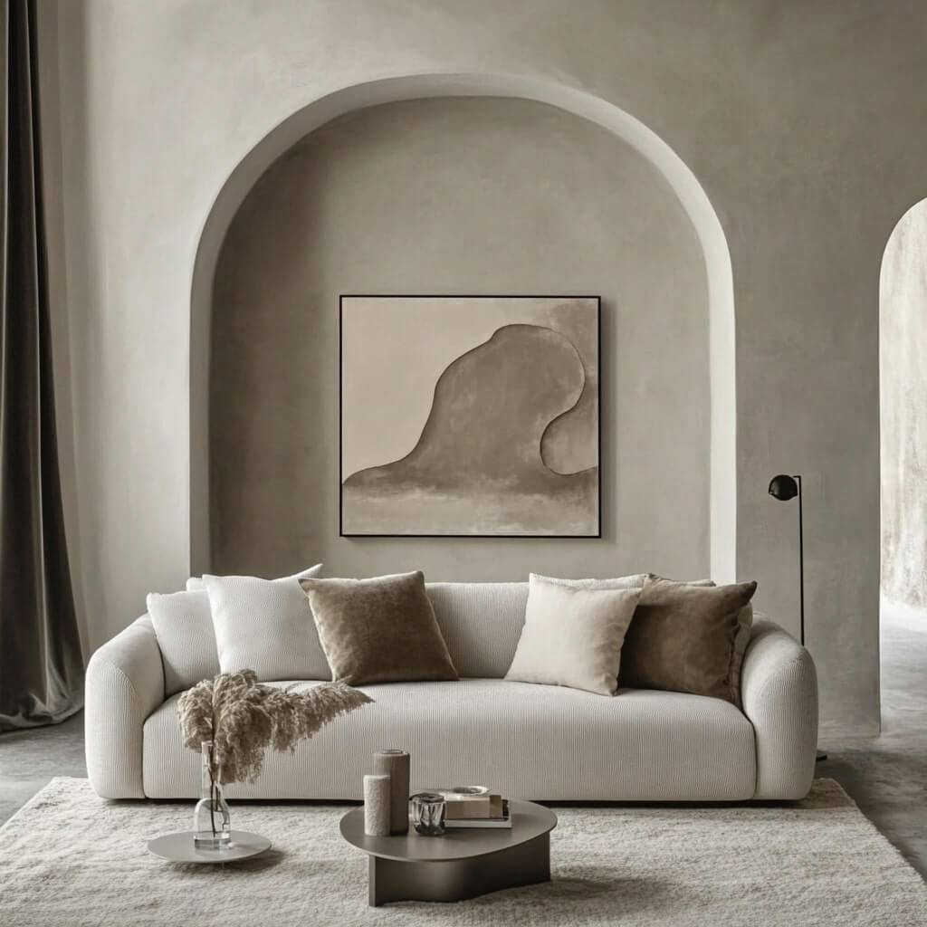
A monochromatic colour scheme that utilises different shades, tones, and tints of a single hue is one of the most striking yet simplest ways to inject visual harmony into a space. It creates an ultra-chic, elegant, and soothing aesthetic.
As we decode how to employ this edited approach to interior decorating, you will learn expert tips on choosing colours, working with colour variants, blending neutrals, and avoiding common mistakes.
Choosing Your Primary Colour
The starting point for any monochromatic arrangement is choosing that one standout base colour that forms the motif for your decor. Contemplate the mood and character you wish your rooms to exude 'fiery red for high drama, ocean blue for relaxed tranquillity, or sunshiny yellow for cheerful positivity.
Lighting Compatibility is Key
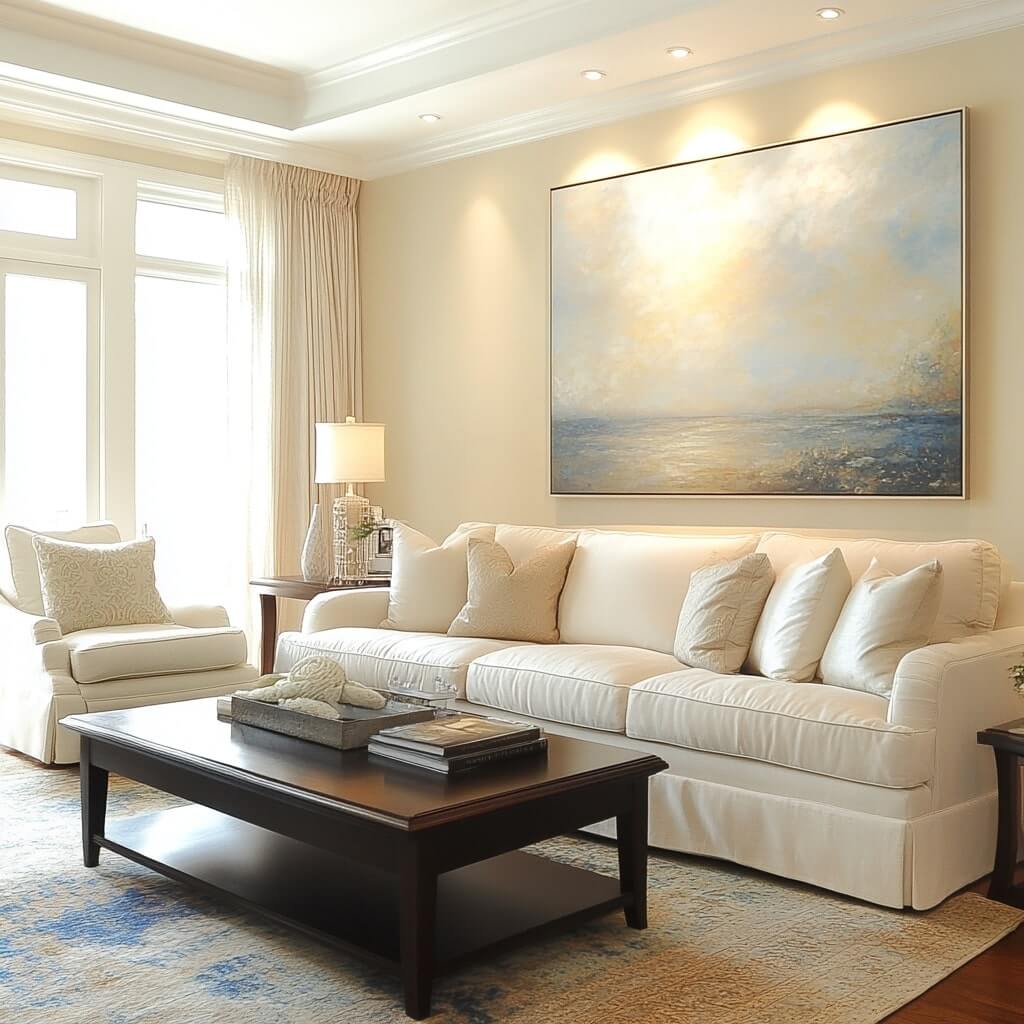
Evaluate the size, architectural detailing, and exposure to natural lighting, as that significantly impacts how colours are perceived. Lighter or softer tones suit generous daylit living rooms and bedrooms, while deeper, saturated hues enhance intimacy and make a statement in low-lit, smaller spaces.
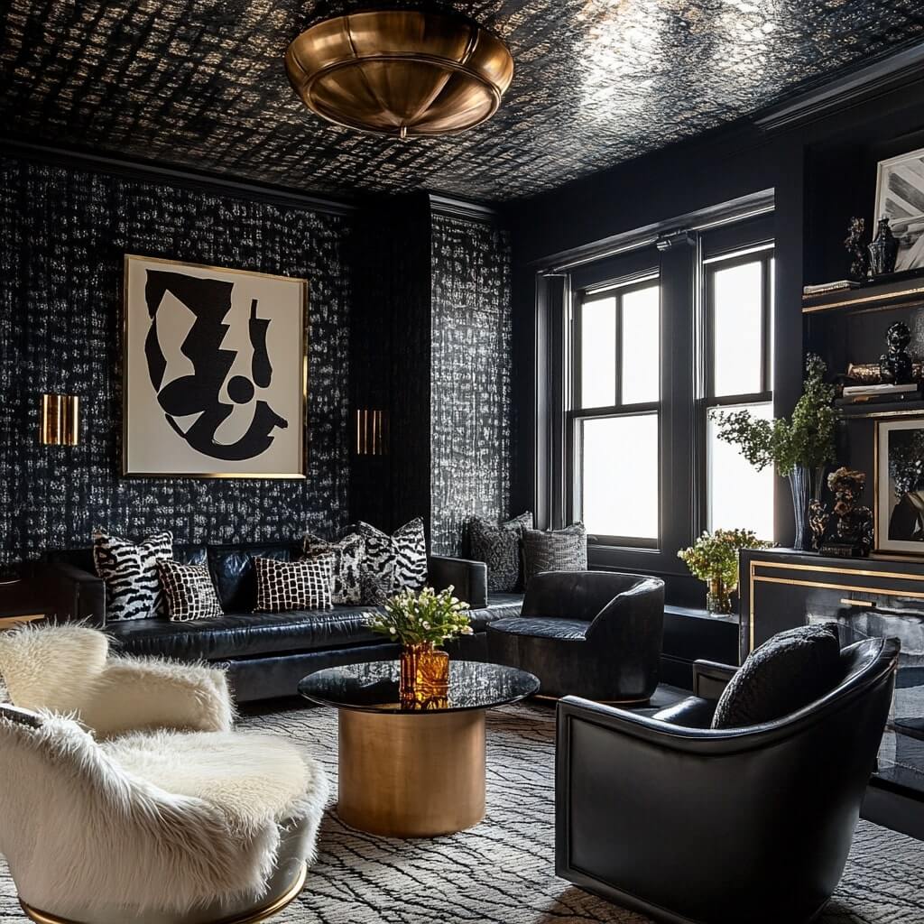
{walls}
Undertones Matter Too
Furthermore, analyse the undertones of potential colours, as they can steer the shade 'temperature' to warmer or cooler. Purple with strong red-leaning injects vibrancy, while green with dominant blue hints will translate more serenely. If unsure, fail-safe neutral browns, beige, and grey bases offer flexibility for scheme experimentation later.
You may also like!
| Home Colour Design | Modern Home Colour Design Combination Ideas |
| House Painting Colour Design | Trendy Wall Colour Combination and Painting Ideas |
| How to Paint a Wall Yourself? | Quick Tips and Tricks for Paint a Wall Yourself |
| IPL Teams Inspired Wall Colours Home | IPL Inspiration for Your Wall Colour Interior Style |
On-Site Colour Analysis
Test swatches of shortlisted colours on walls at different times of the day. Hues display their personalities distinctly under warm incandescent bulbs, LED lighting, or transparent daylight. Verify your final selection suits the functional purpose of the room before fully committing.
Understanding Tones, Tints, and Shades
When working with tones, tints, and shades, it is important to:
Skillfully Modulating Depth and Contrast
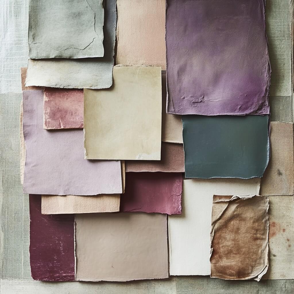
Working thoughtfully with different chromatic variants by intentionally modulating tones, tints, and shades is fundamental for preventing monotony and enriching monochromatic schemes with natural dimensions. Briefly, tints lighten a colour by adding white, while shades deepen it with black or grey pigments. Tones subtly mute or grey down the brightness.
{walls}
Strategic Distribution is Key
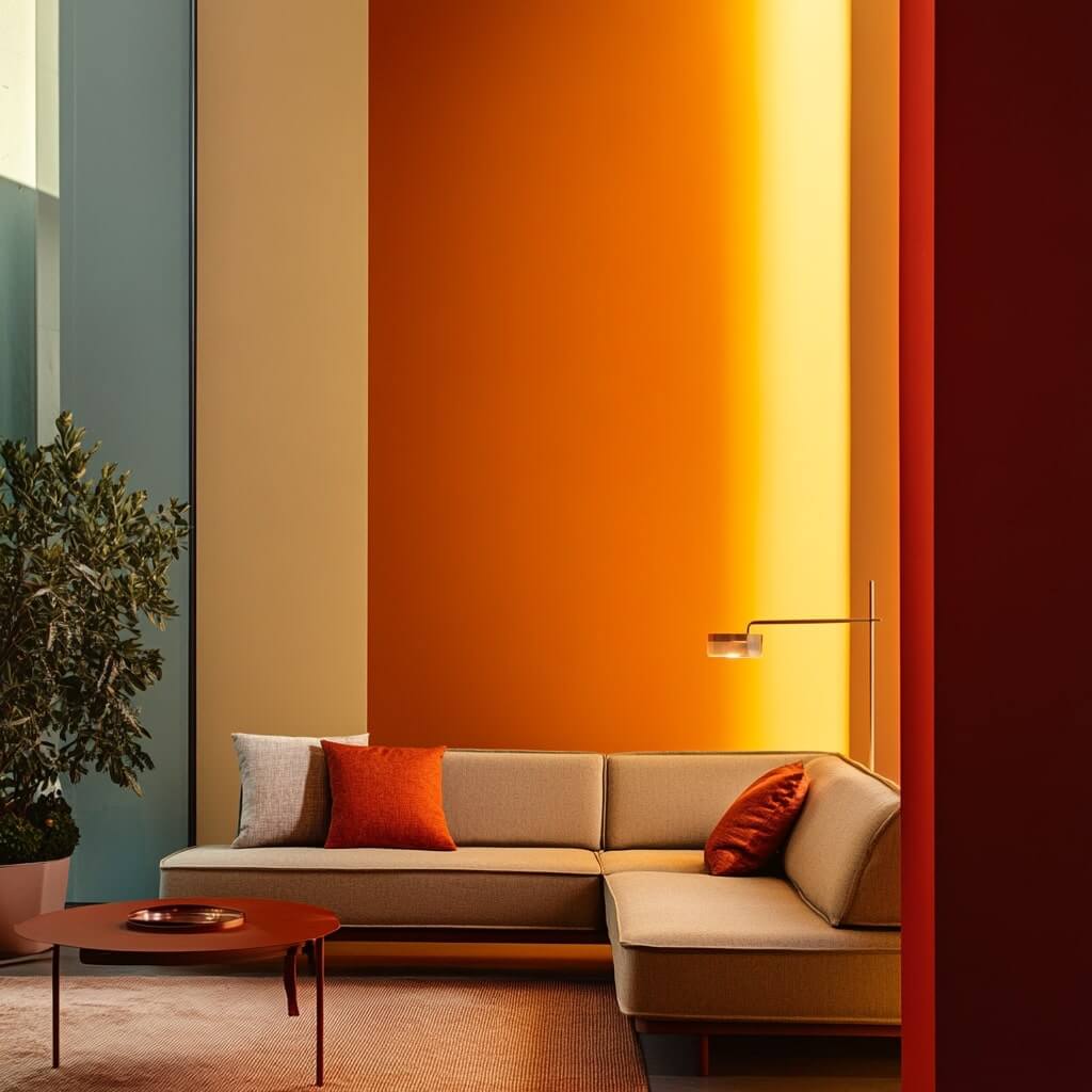
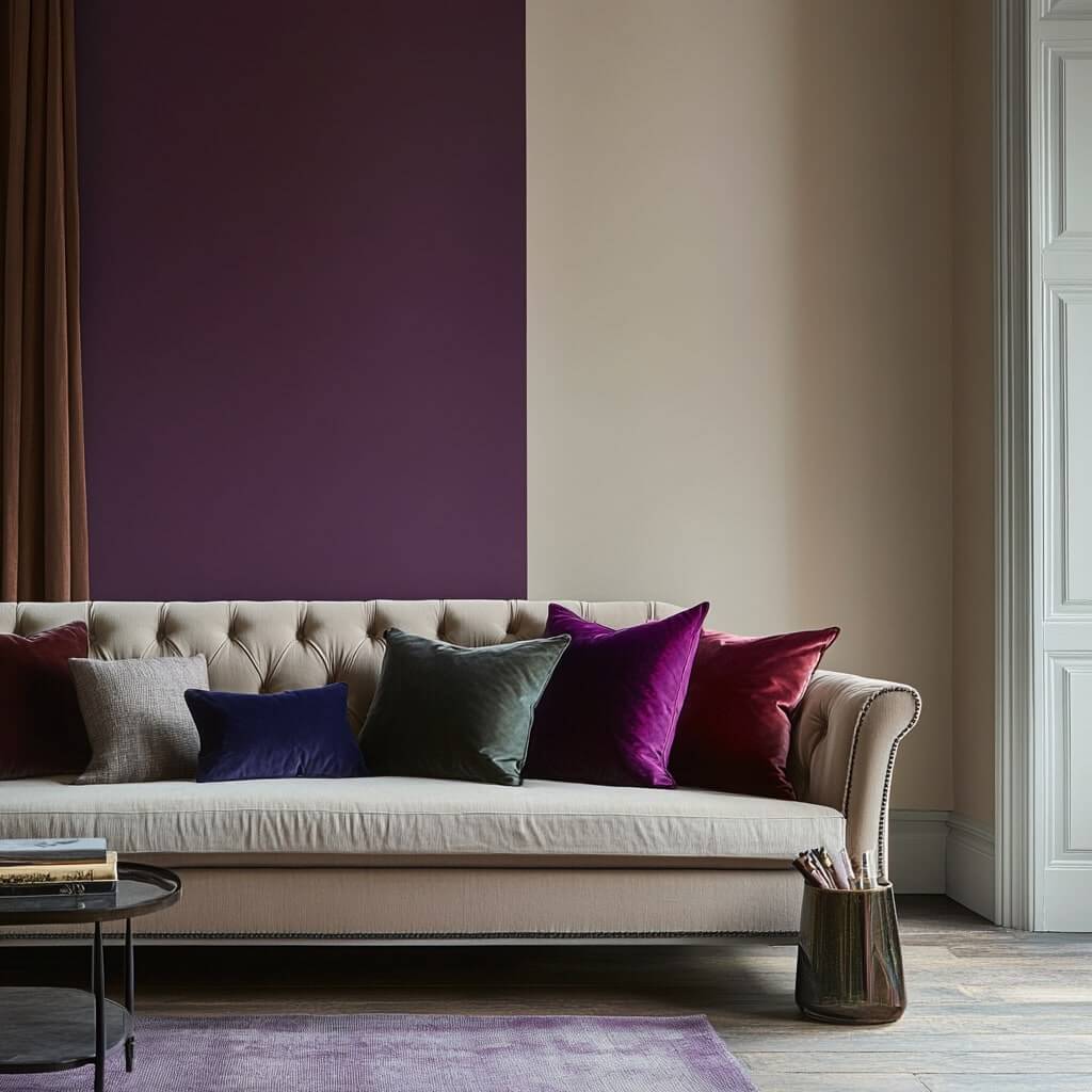
Leverage these distinct derivatives cleverly across surfaces, fabrics, and furnishings to prevent flat one-dimensionality. For example, use deeper tones like crimson red on accent walls and lighter baby pink tints on the remaining walls. Go further and vary sheens combine those matte walls with high-gloss lacquered cabinets for added visual interest.
Consider a mid-tone rug, lighter-tinted sofa, and deepest red velvet pillows, too, for clever tonal mixing. Such intentional distribution of variants across materials, textures, and finishes prevents uniform flatness and creates the desired depth and dimension.
Blending With Accents and Neutrals
To blend sensibly with accents and neutrals, it is important to know how to:
Skillfully Balancing Through Contrasts
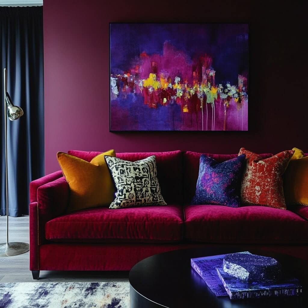
To prevent the overpowering continuity of a single colour family from appearing bland, accent colours and neutral shades are critical for equilibrium. Complementary colour pop-ups like azure blue cushions against brick red sofas or fluorescent chartreuse art against dark purple walls make lively highlights. Retain such vivid contrasting accents only to select statement pieces so the base colour still dominates.
Temper With Earthy Textures
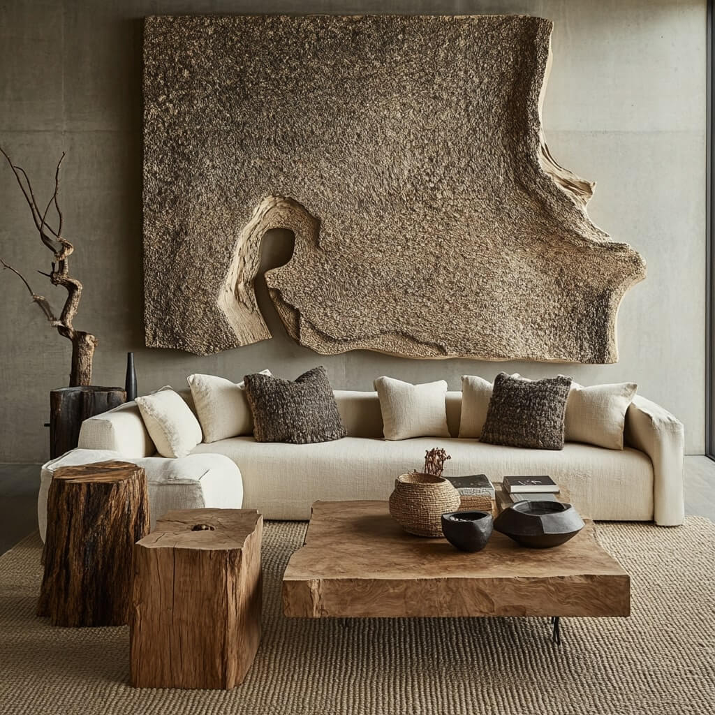
Serene earth tones like cream, beige, and walnut brown have a tempering effect – their innate warmth counters the coolness of bolder jewel tones. Textural neutrals, especially natural materials like linen, wood, and stone, lend much-needed weight through their raw, organic qualities.
Pepper these grounding elements thoughtfully without overwhelming the intended colour statement. Get the balance of accents and neutrals right to frame your chosen colour to its best advantage!
{walls}
Applying Monochromatic Schemes by Room
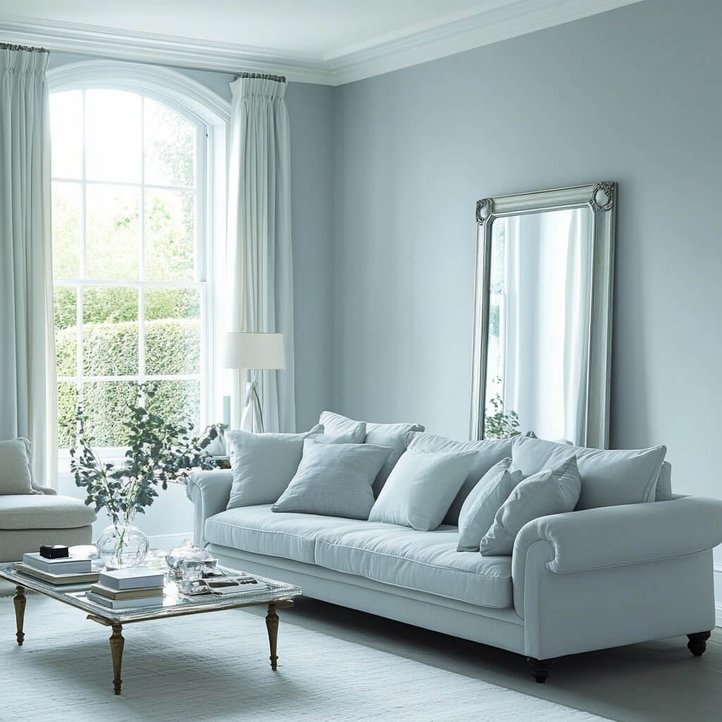
Tailor your monochrome to each living zone for optimum impact. In airy, sunlit spaces like living rooms, lighter tones prevent gloominess. Try sophisticated blue-greys or soft mauve pinks and lacquer one wall in a deeper variant. Place large mirrors and glass-topped tables to maximise lightplay.
For restful and master bedrooms, use muted shades like dove grey or serene sage green. Define architectural contours with darker tones and keep lighter accents clean and crisp. Incorporate natural textures like stone or wood to further tranquillity.
Modular Kitchens and bathrooms suit cleaner colours like cooler blues, emerald greens, and even daring red. Glossy cabinetry in the deeper shade prevents drabness. Contrast with porcelain or quartz countertops while unifying with same-tone tile backsplashes. Chrome fittings complete the modern vibe.
Enhancing with Accessories and Furnishings
Weave tonal continuity into your monochrome story by dressing windows, beds, or tabletops in well-chosen fabrics like silk, velvet, or linen. Designer ceilings with same-scheme wallpaper work wonders. Pepper unique lucite, marble, or leather furnishings throughout to prevent predictability. Sculptural lighting, swanky bar carts, and frameless mirrors all make dramatic accents against unchanging backdrops.
Strategically hang graphic artwork for striking colour blocks. Flaunt prized ceramics, coloured glass collections, or fresh florals in matching-hued vases for oft-changing points of interest.
Common Mistakes to Avoid
While monochrome palettes promise glamorous sophistication, they can go disharmonious without proper precautions. Avoid these common pitfalls that novices often make when attempting these elevated colour schemes:
Limiting Tonal Variance
Do not limit tones to just light, medium, and dark variants of your base shade, as that excessively minimises the scheme's versatility. Broaden the spectrum across the tonal wheel for adequate selection. Having multiple derivatives allows artful distribution across room zones, fixtures, soft furnishings, etc., for enhanced depth perception.
Over-accessorising
Resist overloading the composition with an excess of bright, contrasting colour accents in fabrics, art, and décor pieces as it visually overwhelms the intended tonal continuity. The dominance of the core colour should not be diminished. Keep accents minimal, retaining only to highlight architectural elements or emphasise a specific furnishing.
Matching Textures
Avoid predictability in textures by selecting near-identical materials or finishes for too many elements. For example, glossy cabinets, shiny metal fixtures, glass tabletops, and lacquered stools together seem repetitive. Similarly, using just variants of wood or leather across multiple furnishings also appears uninspired. Remember, thoughtful variation in materials, patterns, and textures creates intrigue!
Insufficient Lighting Evaluation
Lighting compatibility assessment is paramount before finalising paint shades, as colours display distinctly under warm, cool, or natural light. Not evaluating undertones under the intended permanent lighting can lead to undesirable hues. Also, avoid darker variants in already dimly-lit, smaller rooms, which can make spaces appear glooming.
You may also like!
| 3D Wall Painting Design for Living Room | Living Room with 3D Wall Painting Designs |
| Flat Paint Ideas | Beautiful Paint Design Ideas for Your Flat |
| PU Paint and Polish | PU Wood Polish and Paints for Interior Wood |
| Ash Colour Combination | Trendy Ash Colour Combinations for Your Home |
Conclusion
A symphony of shades, the monochromatic colour scheme may use a solo hue, but it creates stunning visual harmony and elegant aesthetics. Give your open-plan rooms or disparate zones an ultra-glam yet tranquil vibe with this simplified approach to interior design.
So embrace the drama and tranquillity of this edited colour concept for flawlessly fashionable decor. Whether modern or romantic, playful or subdued, monochromatic schemes unlock endless interpretations. With the tips revealed above, may colour-blocking made elementary now help manifest your decorative vision!
Inspired to embrace a gracefully minimalist monochrome interior? Our experts at the Interior Company can help craft amazing designs tailored specifically for you and your family’s style.
*Images used are for illustration purposes only. Interior Company does not hold any copyright to the images unless mentioned explicitly.*
Wall Paint Design Ideas for You
- Theme
- Color
- Room Type
Ready for a home transformation?
Let our designers assist you!
Recent Posts


Look at the light in the room and the way it hits each wall. Cooler north-facing walls may call for a soft blue, while warm southern exposures can embrace earthy beiges beautifully.
Limit your darkest accent shades to no more than 3 tones deeper than your lightest wall colour to retain soothing cohesion. For example, pearl white walls would pair well with a pale dove grey and soft charcoal for contrast.
Going overboard on textures can create a busy feeling that distracts rather than enhances the minimalist aesthetic. Also, improper lighting can fail to highlight dimensions in all one colour.
Steer clear of bright accent colours to allow your peaceful palette to make a statement. Vibrant tertiary hues like citrine orange, ruby red or emerald green tend to compete.
Incorporate strategic lighting like wall sconces, floor lamps and instalments of can lights. Metallic finishes like brass, silver or iron provide a flattering glow against grey or beige backdrops.
Related Category
- Bathroom
- Bedroom
- Kitchen
- Living Room
- Walls and Texture