- Design Ideas
- Cities
- Trends
- Guides
- Price Calculators
- Interior DesignersNEW
- Our Portfolio
- More
25+ Unique Kitchen Colours As Per Vastu For Health, Wealth And Harmony

The kitchen is more than just a place to cook. It is where food, conversations, and everyday moments come together. In Vastu Shastra, the ancient Indian science of architecture, the kitchen is one of the most powerful spaces in a home. It is seen as the heart of the home, influencing health, mood, and overall family harmony.
According to Vastu Shashtra, colours are powerful. Every colour carries a certain vibration. A thoughtfully chosen colour can make a kitchen feel welcoming, energetic, and calm. When the colours are wrong, the kitchen.
Table of Content
Why Colours Matter in Vastu Shastra?
Best Kitchen Colours as Per Vastu
Kitchen Colours to Avoid as Per Vastu
Vastu Tips for Walls, Cabinets, and Countertops
Colour Combinations That Work Well as Per Vastu
Matching Kitchen Colours With Vastu Directions
Additional Vastu Colour Tips for the Kitchen
Because the Right Colours Change Everything

Using kitchen colour as per Vastu helps to design a modular kitchen that looks inviting, feels peaceful, and supports the well-being of everyone in the home. This guide explains kitchen colours according to Vastu, their significance, direction-based colour choices, expert tips, and common mistakes to avoid.
Why Colours Matter in Vastu Shastra?
In Vastu Shastra, colours play an important role in influencing the energy, mood, and overall harmony of a space. Each colour is closely associated with one or more of the five natural elements, i.e. fire, water, earth, air, and space. Colour selection is never random in Vastu. It depends on the direction of the space, its function, and the dominant element. When used correctly, colours help to balance these elements and create positive energy within a home.

The kitchen is dominated by Agni, the fire element. So, it needs colours that support warmth without creating aggression or restlessness. Warm colours support cooking and appetite, while lighter and neutral shades help to control excess heat and create a calm environment.
According to Vastu, an ideal kitchen colour should:
- Balance the Agni element without creating excess heat.
- Create a warm and welcoming cooking space.
- Support a healthy appetite and digestion.
- Reduce stress, aggression, and restlessness while cooking.
- Align with the kitchen's direction for proper energy flow.
- Work well with natural light to keep the space bright and airy.
- Enhance cleanliness and freshness in the kitchen.
- Promote positivity, harmony, and emotional balance at home.
Also Read: Best Kitchen Direction as per Vastu to Attract Positive Energy
Best Kitchen Colours as Per Vastu
As per Vastu, choosing the right kitchen colours helps to balance fire energy and create a positive, healthy cooking space. Explore the best colours for your kitchen as per Vastu Shastra:
Yellow: The Most Auspicious Kitchen Colour

Yellow is the best colour for the kitchen according to Vastu. It symbolises warmth, positivity, and nourishment. Yellow improves digestion and uplifts mood. It keeps the kitchen energetic yet calm.
Best Use:
- Kitchen walls
- Ceilings
- Light yellow cabinets
Avoid very dark mustard shades. Soft and pastel yellow works best.
Also Read: Best Kitchen Colour Combination Ideas for a Stylish Space
White and Off-White: Clean and Balanced

White represents purity and cleanliness. It reflects light and makes the kitchen feel spacious. White does not disturb fire energy. Instead, it balances it.
Best Use:
- Walls
- Cabinets
- Counter backgrounds
Cream and ivory are better than stark white for Indian kitchens. They feel warmer.
Beautiful White Kitchen Design Ideas You Should Inspire From
Green: Balance and Freshness

Green represents life and balance. It helps to soothe excessive fire energy. Green works well in modern kitchen designs. The colour creates a fresh and peaceful environment.
Best Use:
- Cabinets
- Tiles
- Accent walls
Try to choose light or pastel green. Avoid very dark green shades.
Also Read: Best Kitchen Paint Colour Ideas You Should Inspire From
Orange: Energy and Appetite Booster

Orange supports fire energy. It increases appetite and enthusiasm. However, orange is a strong colour, so too much of it can feel overwhelming.
Best Use:
- Backsplashes
- Small accent walls
- Kitchen accessories
Avoid painting your entire kitchen orange. It will make it look too loud and flashy.
Orange Kitchen Design Ideas to Bring Warm Hues into Your Cooking Space
Red: Use With Caution

Red is pure fire energy. Vastu allows red, but only in limited quantities. Too much red increases aggression and restlessness.
Best Use:
- Small accent walls
- Decorative tiles
- Minor design highlights
Never paint all kitchen walls red. It will lead to a restless environment, instead of a calm, peaceful vibe.
Red Kitchen Design Ideas for Your Modern to Traditional Cooking Space
Beige, Cream, and Earthy Shades

Earthy colours stabilise energy. They bring grounding and comfort. These colours are always safe and versatile, and work well in most directions.
Best Use:
- Cabinets
- Flooring
- Countertops
Light brown and beige should be preferred over dark shades.
You may also like!
| Semi Modular Kitchen Design | Semi Modular Kitchen Design Trends for Home |
| Kitchen Partition Ideas | Stylish Kitchen Partition Ideas for Modern Homes |
| Kitchen Wallpaper Design | Best Kitchen wallpaper Design to Suit Your Mood |
| Kitchen Curtain Ideas | Simple Kitchen Curtain Designs Ideas for Indian Home |
Kitchen Colours to Avoid as Per Vastu
In Vastu Shastra, the kitchen is governed by the fire element. Using the wrong colours here can disturb this balance. Some shades suppress fire energy, while others can create heaviness or emotional discomfort.
Black

Black absorbs energy. It creates a heavy and dull atmosphere. This can reduce positivity and affect the mood in the kitchen. Vastu strongly advises avoiding black on walls, cabinets, or flooring.
Also read – 20+ Best Kitchen Design Tips: Everything You Need To Plan The Perfect Kitchen
Dark Blue

Blue represents the water element. Water directly clashes with fire energy. Using dark blue in the kitchen can disturb balance and affect digestion. So, it should be completely avoided.
Dark Grey

Dark grey makes the space feel lifeless and cold. It dulls energy and reduces warmth. Kitchens painted in dark grey often feel uninviting and low on energy.
Read also - Modular Kitchen Cost In India for 2026: How Kitchen Pricing Really Works
Other Dark Shades

Deep browns, maroons, or charcoal tones overpower the space. They block light and make the modular kitchen feel heavy. These colours are not suitable for a space dominated by fire.
Read also – 10+ Stunning Kitchen Floor Tile Designs for Modern Home
Neon or Extremely Bright Colours

Neon shades overstimulate the senses. They create restlessness instead of comfort. Such colours break the visual and energy balance.
While these colours are trendy, they are not ideal for a Vastu-aligned kitchen. Avoiding these colours will help to maintain harmony in the kitchen. Vastu works best when colours feel warm, light, and balanced, and not overpowering.
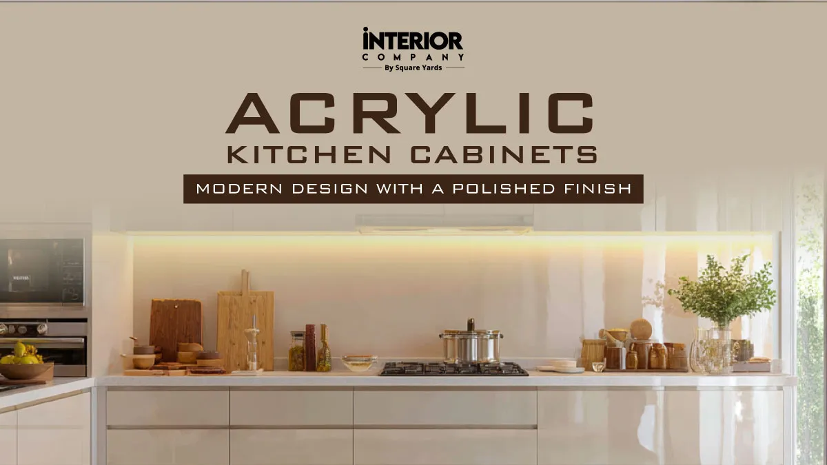
Also read – Acrylic Kitchen Cabinets: Know It’s Types, Finishes, Colours, Cost and More
Vastu Tips for Walls, Cabinets, and Countertops
In Vastu, each part of the modular kitchen plays a role in energy flow. Thus, it is important to choose the right kitchen colour as per Vastu. Here are the best colours for walls, cabinets, and countertops to maintain balance.
Kitchen Walls

Here are the tips for the colour of kitchen walls as per Vastu:
- Use light, warm, and bright colours.
- Avoid very dark or overly glossy shades.
- Pastels and soft tones work best.
Also Read: Stylish Kitchen Wall Decor Ideas to Refresh Your Culinary Space
Kitchen Cabinets

Here are the kitchen cabinet colour ideas as per Vastu:
- Neutral shades like cream, beige, pastel green, or light wood are ideal.
- Avoid black or very dark brown cabinets.
- Dual-tone cabinets should follow directional Vastu rules.
Also Read: Best Kitchen Cabinet Material and Finishes You Should Know Before Designing Your Space
Countertops & Backsplashes

- White, light granite, or quartz surfaces are preferred.
- Avoid dark stone slabs that absorb light.
- Use subtle patterns rather than heavy designs.
Also Read: Types of Kitchen Countertop Design You Should Know from the Expert
Colour Combinations That Work Well as Per Vastu
Using the right colour combinations helps to maintain both visual harmony and positive energy in the kitchen. As per Vastu, it is recommended to pair light, warm shades with soft neutrals for the best results. Here are a few kitchen colour combinations as per Vastu:
Yellow and White: Create warmth while keeping the space bright and balanced.

Peach and Cream: Add energy without overwhelming the senses.

Light Green and Beige: This combination feels fresh, calm, and grounding.

White and Pastel Orange: It offers a modern look while being Vastu-friendly.
Read also – Gloss vs Matte Kitchen Cabinets: What Actually Works in a Real Kitchen?

It is best to limit to two or three complementary colours in a kitchen. This keeps the space visually soothing and energetically balanced, as per the Vastu principles.
Read also - Modular Kitchen Trends 2026: Latest Kitchen Design Trends That Work in Real Homes
Matching Kitchen Colours With Vastu Directions
South East Kitchen Colour as per Vastu

The South-East direction is ruled by the fire element and is considered the most auspicious location for a kitchen.
Recommended Colours:
- Orange
- Coral
- Peach
- Pink
- Red (Only as Highlights)
These colours strengthen fire energy and create an active, energetic cooking space. However, excessive red can lead to aggression and restlessness. So, it should be used sparingly, such as in backsplashes, accessories, or small wall sections.
Also read – 10+ Unique Kitchen Themes: Creative Ways To Give Your Kitchen Its Own Personality
East-Facing Kitchen

The east direction is associated with the rising sun, health, growth, and new beginnings.
Recommended Colours:
- Light green
- Yellow
- Cream
- Soft Beige
Green means freshness and balance, while yellow represents happiness and brightness. Together, they promote good digestion, mental clarity, and a cheerful atmosphere.
North-Facing Kitchen

The north direction is governed by the water element and is linked with wealth, career growth, and opportunities.
Recommended Colours:
- Light Blue
- Mint Green
- Very Light Grey
Since fire and water are opposing elements, these soft shades help to maintain a balance. Avoid bold colours like red or dark orange in north-facing kitchens.
Read also - 60+ Latest Kitchen Colour Combination That Transform Your Space Into A Modern Haven
West-Facing Kitchen

The west direction represents stability, discipline, and grounding energy.
Recommended Colours:
- Off White
- Light Yellow
- Ivory
- Cream
These colours help to balance excess heat and keep the kitchen calm and balanced, especially in homes where cooking is done more frequently.
Read also – Unique Beige Kitchen Design Ideas You Should Inspire From
North East Kitchen Colour as per Vastu

The north-east direction is associated with water and spiritual energy, making it unsuitable for kitchens, which are governed by fire. However, if the kitchen is already placed here, the colour selection becomes extremely important.
Recommended Colours:
- White
- Pale Blue
- Very Light Green
Avoid warm, dark, or bold colours completely in this direction, as they can disturb peace.
Also read – 5+ Best PVC Kitchen Cabinets Design: Tough On Mess And Easy On Maintenance
Additional Vastu Colour Tips for the Kitchen

Apart from choosing the main colours for your kitchen walls, it is important to keep a note of the small colour-related details in Vastu. Following these simple Vastu colour tips helps create a kitchen that feels warm, balanced, and pleasant to use every day.
- Prefer light and soothing shades if the kitchen is small or gets less natural light.
- Use bold colours only as accents, not on complete walls or cabinets.
- Keep the ceiling in white or off-white to maintain openness.
- Avoid mixing too many contrasting colours, as it creates visual imbalance.
- Match cabinet and countertop colours to maintain balance.
You may also like!
| Kitchen Window Design | Stylish Kitchen Window Ideas for Every Kind of Kitchen |
| Kitchen Lighting Design | Best Kitchen Lighting Ideas and Trends |
| Open Shelves Kitchen Design | Open Kitchen Shelving Ideas for Perfect Space |
| Kitchen Laminates | Perfect Two Colour Combination for Kitchen Laminates |
Because the Right Colours Change Everything
Choosing the right kitchen colour as per Vastu is a small but powerful way to improve the energy of your home. With the right colours, the kitchen becomes a space that supports health, harmony, happiness, and prosperity within the family.
Vastu can feel complex when designing a modern kitchen. Interior Company makes it simple by designing kitchens that bring together the right colours, layout, and daily comfort.
'Images used are for representational purposes only. Unless explicitly mentioned, the Interior Company does not hold any copyright to the images.'
kitchen Design Ideas for You
- Shape
- Color
- Finish
- Theme
- Backsplash Color
- Backsplash Material
- Cabinet Style
- Counter Colour
- Floor Material
- Size
- Almond Brown Color Kitchen Design
- Beige Color Kitchen Design
- Black Color Kitchen Design
- Blue Color Kitchen Design
- Brown Color Kitchen Design
- Charcoal Black Color Kitchen Design
- Charcoal Grey Color Kitchen Design
- Coral Color Kitchen Design
- Cream Color Kitchen Design
- Dark Grey Color Kitchen Design
- Gold Color Kitchen Design
- Green Color Kitchen Design
- Grey Color Kitchen Design
- Ivory Color Kitchen Design
- Light Brown Color Kitchen Design
- Multicolour Color Kitchen Design
- Natural Brown Color Kitchen Design
- Nude Color Kitchen Design
- Off White Color Kitchen Design
- Olive Color Kitchen Design
- Olive Green Color Kitchen Design
- Olive Rust Color Kitchen Design
- Orange Color Kitchen Design
- Pink Color Kitchen Design
- Purple Color Kitchen Design
- Red Color Kitchen Design
- Silver Color Kitchen Design
- Smokey Blue Color Kitchen Design
- Smokey Grey Color Kitchen Design
- Stone Color Kitchen Design
- Teal Color Kitchen Design
- White Color Kitchen Design
- Wooden Brown Color Kitchen Design
- Yellow Color Kitchen Design
- Contemporary Theme Kitchen Design
- Cottage-Style Theme Kitchen Design
- Countryside Theme Kitchen Design
- Industrial Theme Kitchen Design
- Luxurious Theme Kitchen Design
- Mid-Century Modern Theme Kitchen Design
- Minimalist Theme Kitchen Design
- Modern Theme Kitchen Design
- Modern -Industrial Theme Kitchen Design
- Rustic Theme Kitchen Design
- Scandinavian Theme Kitchen Design
- Traditional Theme Kitchen Design
- Beige Backsplash Color Kitchen Design
- Black Backsplash Color Kitchen Design
- Blue Backsplash Color Kitchen Design
- Brown Backsplash Color Kitchen Design
- Gray Backsplash Color Kitchen Design
- Green Backsplash Color Kitchen Design
- Metallic Backsplash Color Kitchen Design
- Multi Backsplash Color Kitchen Design
- Orange Backsplash Color Kitchen Design
- Red Backsplash Color Kitchen Design
- White Backsplash Color Kitchen Design
- Yellow Backsplash Color Kitchen Design
- Brick Backsplash Material Kitchen Design
- Cement Tile Backsplash Material Kitchen Design
- Ceramic Tile Backsplash Material Kitchen Design
- Engineered Quartz Backsplash Material Kitchen Design
- Glass Tile Backsplash Material Kitchen Design
- Granite Backsplash Material Kitchen Design
- Marble Backsplash Material Kitchen Design
- Matchstick Tile Backsplash Material Kitchen Design
- Mosaic Tile Backsplash Material Kitchen Design
- Porcelain Tile Backsplash Material Kitchen Design
- Stone Slab Backsplash Material Kitchen Design
- Stone Tile Backsplash Material Kitchen Design
- Subway Tile Backsplash Material Kitchen Design
- Terra-Cotta Tile Backsplash Material Kitchen Design
- Travertine Backsplash Material Kitchen Design
- Window Backsplash Material Kitchen Design
- Wood Backsplash Material Kitchen Design
- Beige Counter Colour Kitchen Design
- Black Counter Colour Kitchen Design
- Blue Counter Colour Kitchen Design
- Brown Counter Colour Kitchen Design
- Gray Counter Colour Kitchen Design
- Green Counter Colour Kitchen Design
- Multi Counter Colour Kitchen Design
- Pink Counter Colour Kitchen Design
- Red Counter Colour Kitchen Design
- White Counter Colour Kitchen Design
- Yellow Counter Colour Kitchen Design
- Carpet Floor Material Kitchen Design
- Cement Tile Floor Material Kitchen Design
- Ceramic Tile Floor Material Kitchen Design
- Dark Hardwood Floor Material Kitchen Design
- Light Hardwood Floor Material Kitchen Design
- Marble Floor Material Kitchen Design
- Medium Hardwood Floor Material Kitchen Design
- Painted Wood Floor Material Kitchen Design
- Porcelain Tile Floor Material Kitchen Design
- Terrazzo Floor Material Kitchen Design
- Travertine Floor Material Kitchen Design
Ready for a home transformation?
Let our designers assist you!
Recent Posts


Yellow is considered the most auspicious kitchen colour according to Vastu. It symbolises warmth, positivity, and nourishment. Yellow supports digestion, uplifts the mood, and keeps the kitchen energetic. The soft or pastel yellow shades are the best for kitchens, especially on walls or ceilings.
In Vastu Shastra, colours influence energy within a space. The kitchen is governed by Agni, the fire element, which affects health, digestion, and emotional balance. The right colours support this fire energy without making it too intense. Proper kitchen colours help to create harmony, promote positivity, and make the cooking space comfortable for daily use.
Yes, white and off-white colour for Vastu-friendly for kitchens. White represents cleanliness and purity. It also reflects light well, which makes the kitchen feel spacious. One must prefer cream and ivory shades over stark white, as they feel warmer and are more suitable for Indian kitchens.
Green is a good colour choice for kitchens. It represents balance, freshness, and growth. Green colour helps to soothe excess fire energy and create a calm environment. Light or pastel green shades work best for cabinets, tiles, or accent walls. Try to avoid dark green colour.
Red colour represents pure fire energy, so it should be used with caution. As per Vastu, red should be allowed in small amounts only, such as on backsplashes, tiles, or minor accents. Using too much red can increase aggression and restlessness, which can make the kitchen feel overwhelming.
Colours like black, dark blue, dark grey, and very dark brown should be avoided in kitchens as per Vastu. These shades absorb light, feel heavy, or clash with fire energy. Neon or extremely bright colours are also not recommended. They create visual imbalance and restlessness.
Yes, direction plays an important role in selecting colours for the kitchen. Warm colours like orange and peach suit south-east kitchens, while east-facing kitchens work well with light green and yellow. Softer shades like mint green or light blue work well in north-facing kitchens as they balance fire and water elements.
Neutral shades like cream, beige, light wood, pastel green, or off-white work best for cabinets. These colours maintain balance and do not overpower the space. Black or very dark cabinets should be avoided as they make the kitchen feel heavy.
Light-coloured countertops such as white, beige, light granite, or quartz are mostly preferred for kitchen countertops. They reflect light and enhance cleanliness. Dark stone slabs should be avoided as they absorb light.
As per Vastu Shashtra, there should be around two or three matching colour shades in the kitchen. Using too many contrasting shades can create a visual and energetic imbalance. A balanced colour palette will keep the kitchen calm, organised, and pleasant for everyday use.
Related Category
- Dining Room
- False Ceilings
- Paint and Color
- Tips and Advice
- Walls and Texture