- Design Ideas
- Cities
- Trends
- Guides
- Price Calculators
- Interior DesignersNEW
- Our Portfolio
- More
- Home
- Trends
- Construction
- Vastu Tips
- Vastu Colours For Home
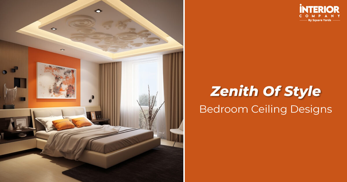
Vastu Colour For Home: Simple Rules For A Peaceful And Positive House

When you walk into a home, the first thing you feel is not the furniture. It is the colour. Colours change the mood of a space. They can make a room feel calm, warm, fresh, or heavy. They affect how your home feels overall.
According to Vastu Shastra, an ancient Indian science of architecture, colours affect the energy, mood, and harmony in your home. Every direction in a house carries a certain type of energy. The right colour supports that energy and brings peace, prosperity, and balance. The wrong ones can create restlessness and stress.
Table of Content

You do not need complicated rules to follow Vastu. You only need to understand how colours work for different directions and rooms. Once you know that, choosing the right shade becomes easier. This guide covers direction-wise colours, room-wise colours, common mistakes, and simple tips to create a balanced and peaceful home.
The Power Of Colour In Vastu
In Vastu, each colour has a meaning and is connected to the five natural elements, which are earth, water, fire, air, and space. The right colour according to direction and room type can:
- Improve energy flow.
- Boost peace and happiness.
- Create balance in the house.
- Support relationships and the well-being of family members.
The colours should align with both Vastu and your overall home design ideas.
The Core Rules Of Vastu Colours

In Vastu, every colour has a symbolic meaning. According to the Vastu Shashtra:
- Light shades are always safer than dark shades.
- Use light and neutral colours for most walls as they feel open and calm.
- Pastel tones work better than bold tones.
- Each direction has an element, and colours should support that element.
- Avoid extreme shades on large walls.
- Choose direction-appropriate colours for the best effects.
Shaping Every Room With The Right Colours
Every room has a purpose. The colours should support that purpose. A bedroom should feel calm. A kitchen should feel active. A living room should feel welcoming.
Here is a simple guide to choosing Vastu colours for different rooms.
Living Room: Welcoming And Positive

The living room is where people gather and relax. It sets the tone of the house. It is important to consider Vastu colours for the living room.
Best Colours:
- Cream
- Off-white
- Light yellow
- Soft green
- Pastel blue
These shades make the space feel open and friendly. They also reflect light well.
Avoid:
- Dark maroon
- Deep purple
- Black accent walls
- Very bold red
Heavy shades can make the room feel smaller, dull, and a bit unwelcoming.
Check Out: Latest Living Room Design Ideas with Elegant Furniture and Modern Decor
Bedroom: Calm And Restful

The bedroom should support sleep and relaxation. Soft colours work best in the bedroom as per Vastu.
Best Colours:
- Light blue
- Lavender
- Soft pink
- Beige
- Pastel green
These colours reduce stress and create a peaceful atmosphere.
Also Read: Best Bedroom Direction as per Vastu for Health and Prosperity
Avoid:
- Bright red
- Neon shades
- Dark grey
- Jet black
Strong and bright colours increase restlessness and disturb sleep.
Check out: Latest Modern Bedroom Design Ideas Customized by Your Preferences
Kitchen: Active And Energetic

The kitchen represents the fire element. It needs warmth, but not an excess of it.
Best Colours:
- Light orange
- Peach
- Warm yellow
- Soft coral
These shades support appetite and activity.
Avoid:
- Black
- Dark blue
- Full grey walls
Too much dark colour weakens the fire energy and creates an imbalance. Choose lighter laminates or wood finishes for your kitchen cabinet design that complement Vastu.
Also Read: Vastu-compliant Kitchen Colours You Should Know for Your Cooking Space
Puja Room: Pure And Peaceful

This space should feel light and spiritual. For spiritual harmony, Vastu colours for the pooja room should always be light.
Best Colours:
- White
- Light yellow
- Soft pastel blue
Keep the walls simple and bright.
Also Read: Ideal Location of Mandir as per Vastu That Maximizes Positive Energy
Avoid:
- Dark shades
- Heavy patterns
- Loud colours
The puja room should never feel heavy or cluttered.
Check out: Latest Mandir Design Ideas in a Variety of Styles for All Types of Homes
Bathroom: Clean And Fresh

Bathrooms should feel light and hygienic.
Best Colours:
- White
- Light grey
- Pale blue
- Soft beige
These shades create freshness and openness.
Also Read: Vastu Tips for Bathroom That Remove Negative Energy from Your Space
Avoid:
- Red
- Dark brown
- Black
Dark colours can make the space feel dull and cramped.
Check Out: Modern Bathroom Design Ideas That Are Both Functional and Stylish
Study Room: Focus And Clarity

The study or home office needs concentration. Thus, the colours should support that energy without any distraction.
Best Colours:
- Light green
- Cream
- Off-white
- Soft blue
These colours support focus without causing strain.
Also Read: Top Study Room Colour Combinations for Focus and Positivity
Avoid:
- Bright red
- Neon colours
- Very dark shades
Dark and bright colours distract the mind.
Don't Miss: Modern Study Room Design Ideas for Concentration and Productivity
Kids' Room: Cheerful But Balanced

Children need energy and comfort together. The colours should support that energy.
Best Colours:
- Light green
- Soft yellow
- Pastel pink
- Sky blue
Choose playful but soft tones.
Avoid:
- Very dark themes
- Aggressive red walls
Too much intensity can affect mood and kill the lively energy.
Check out: Functional Kids' Room Design Ideas That Enhance Your Child's Imagination
When Directions Decide The Colour
In Vastu Shastra, each direction is linked to a specific element and type of energy. Choosing colours based on direction is one of the most important Vastu tips for the home. The idea is simple. Support the natural energy of that direction. Do not work against it.
North: Growth And Opportunities

The north direction is linked with the water element and peace, growth and prosperity.
Best Colours:
- Light green
- Mint green
- Aqua blue
- Turquoise
These shades support movement, freshness, and prosperity.
Avoid:
- Red
- Dark brown
- Deep black
Strong fire or heavy shades disturb the natural flow of this direction.
Best Use In: Living room, study room.
East: Health And New Beginnings

The east receives the morning sunlight. It represents clarity and positive energy.
Best Colours:
- White
- Cream
- Light yellow
- Soft peach
These shades enhance brightness and promote mental peace.
Avoid:
- Dark grey
- Black
- Very dark blue
Dark colours can block natural light and reduce positivity.
Best Use In: Hall, prayer room, entrance.
South: Strength And Stability

The south direction is connected to the fire element. It represents power and confidence.
Best Colours:
- Coral
- Terracotta
- Warm pink
- Light red
These shades strengthen the fire energy in a balanced way.
Avoid:
- Blue
- Black
- Water-based shades
Water colours weaken the fire element.
Best Use In: Dining area, guest room.
West: Balance And Support

The west direction is linked with stability and emotional balance.
Best Colours:
- Light blue
- Grey-blue
- Beige
- Off-white
These colours create calmness and comfort.
Avoid:
- Bright red
- Strong orange
Too much fire energy creates an imbalance.
Best Use In: Family lounge, study.
North-East: Peace And Spiritual Energy

This is the most sensitive and important direction in Vastu.
Best Colours:
- White
- Light yellow
- Very light blue
- Soft green
Keep this area light, open, and peaceful.
Avoid:
- Dark shades
- Red
- Heavy textures
The north-east part of the home should never feel heavy or cluttered.
Best Use In: Puja room, meditation space.
South-West: Stability And Relationships

This direction represents grounding and long-term stability.
Best Colours:
- Beige
- Cream
- Light brown
- Earth tones
These colours create security and strength.
Avoid:
- Bright green
- Blue
These colours may disturb the grounding effect of this zone.
North-West: Movement And Communication

This direction supports relationships and social energy.
Best Colours:
- White
- Light grey
- Cream
These shades keep the space open and balanced.
Avoid:
- Dark red
- Very dark tones
They can create tension in this zone.
Choosing direction-wise colours does not mean repainting your entire house. Even one main wall can help. Keep colours soft and natural. And always match them to the direction of the room.
Colours That May Block Positive Energy

In Vastu Shashtra, it is recommended to avoid very dark, harsh, or overly bold colours on large walls. These shades can create heaviness, restlessness, or imbalance in the home. Avoid using the following colours:
- Black on the main walls or in bedrooms and the north-east direction.
- Dark grey in living rooms.
- Deep red in bedrooms or study rooms, as it increases aggression.
- Very dark brown in small rooms, as it makes them feel heavy.
- Neon or extremely bright shades in the bedroom or the living room.
Also, avoid using too many dark colours in one space. Choose lighter and softer tones as they maintain balance and keep the home open and positive.
The Right Colours, The Right Energy
Choosing the right Vastu colour for the home is all about balance. It is not about following strict rules, but using shades that feel calm, positive, and comfortable every day. When colours match the direction and purpose of each room, the home naturally feels more balanced and harmonious.
If you are unsure about selecting the right colours, Interior Company can help you choose colours that align with Vastu, while also matching your personal style and design needs.
'Images used are for representational purposes only. Unless explicitly mentioned, the Interior Company does not hold any copyright to the images.'
Ready for a home transformation?
Let our designers assist you!
Recent Posts


According to Vastu, colours influence the energy of a space. Each direction carries a specific type of energy. The right colour supports that energy. This creates peace, positivity, and comfort in the home. If wrong colours are used, they create an imbalance in the home.
Light and neutral shades work best in living rooms. Cream, light yellow, soft green, and pastel blue are good options. These colours make the space feel open, positive, and welcoming.
Soft and calming shades are ideal for bedrooms. Light blue, lavender, beige, pastel green, and soft pink lead to relaxation and better sleep. Avoid very bright or dark colours in bedrooms.
Dark shades like black, deep brown, and strong red should be avoided in the North-East direction. This zone should remain light and peaceful.
Yes, white is considered pure and positive. As per Vastu, it works well in most directions, especially in the east and north-east. It also makes spaces look larger and brighter.
Yes, dark colours are not completely banned in Vastu. However, they should not be used on large walls or in sensitive zones. Use them only as accents in decor or furniture.
The kitchen represents the fire element. Warm colours like peach, light orange, coral, and soft yellow are suitable. These shades support the fire element of the kitchen.
Yes, blue is a good colour choice, but the placement matters. Light blue works well in the west and bedrooms. However, dark blue should be avoided in the South direction.
If the bedroom is in the south-west direction, use earthy tones like beige, cream, and light brown. These colours create stability and strength in relationships.
For a study room, you can go with light green, cream, off-white, and soft blue as these colours support focus and clarity. Avoid bright red or neon shades in study areas.
Vastu recommends keeping ceilings white or off-white. Dark ceilings can make a room feel heavy and closed.
The puja room is supposed to be calm and sacred. White, light yellow, and soft pastel shades are best for a puja room. These colours create a calm and spiritual atmosphere.
In such cases, choose a neutral base like cream or off-white. You can add a soft accent shade that supports both directions without creating an imbalance.
Yes, pastel shades are safer and more balanced as per Vastu. They maintain calmness and work well in most areas of the home.
Colours alone cannot solve every problem. However, as per Vastu, they do influence mood and comfort. When a home has the right colours, they support a peaceful and harmonious environment.
Related Category
- Bedroom
- Exterior Design
- Kitchen
- Living Room
- Tips and Advice