- Design Ideas
- Cities
- Trends
- Guides
- Price Calculators
- Interior DesignersNEW
- Our Portfolio
- More
- Home
- Trends
- Furniture And Decor
- Paint And Color
- Colour Combinations Of Orange
30+ Amazing Colour Combinations of Orange That You Will Simply Love

People have different takes on orange. Some love the earthy side of it, like terracotta walls, rust fabrics, and clay finishes. Others immediately think of older, bright orange paints that made entire rooms feel smaller by evening. And honestly, both reactions make sense.
A good orange colour combination depends heavily on what sits around it. In one home, a muted peach wall may look soft and quiet for most of the day. In another, the same shade starts picking up yellow tones from warm ceiling lights and suddenly feels much brighter at night. Darker shades in an orange wall colour combination behave differently again. They need lighter surfaces nearby; the room starts feeling visually heavy quite fast.
Table of Content
Why Orange Feels Different In Every Home?
Best Orange Colour Combination Ideas For Different Styles
Orange Wall Colour Combination Ideas For Living Rooms
- 3.1 Burnt Orange With Cream And Wood Tones
- 3.2 Peach Orange With Off-White Interiors
- 3.3 Grey And Orange For Modern Living Rooms
- 3.4 Olive Green And Rust Orange Living Rooms
- 3.5 Black Accents With Orange Walls
- 3.6 The White Canvas With Orange Colour Is The Perfect Mix of Harmony
- 3.7 The Subtle Balance Of Grey And Orange
- 3.8 The Natural Companion Green
- 3.9 The Bold Black And Orange Is Class
- 3.10 The Royal Contrast of Purple With Orange
- 3.11 The Luxurious Orange And Shiny Gold
- 3.12 The Soft Whisper of Cream With Orange
- 3.13 The Earthy Connection of Brown And Orange
- 3.14 The Delicate Contrast of Lavender With Orange
- 3.15 The Majestic Cobalt Blue And Orange
- 3.16 The Subdued Harmony of Olive Green Clubbed With Orange
- 3.17 The Vibrant Contrast of Magenta And Orange
Orange Two Colour Combination For Bedroom Walls
Light Orange vs Dark Orange Colour Combination
Colours That Match With Orange According To Interior Style
Finding The Right Balance With Orange Interiors
Maybe that is why orange rarely works alone. Most good interiors using orange are actually balancing it with something softer, including off-white walls, walnut wood, textured beige fabric, muted greens or even simple linen curtains.
Why Orange Feels Different In Every Home?
Orange is probably one of the few wall colours that can look completely different by evening. A muted peach shade may feel soft through the afternoon, then suddenly appear much brighter once warm ceiling lights come on. Darker rust and terracotta shades have their own issue. In smaller rooms, especially ones already filled with dark wood or bulky furniture, they can start feeling heavier than expected. That is also why most colours that match with orange are mostly quieter shades like off-white, beige, muted green and soft wood tones. A balanced colour scheme for orange often depends less on the colour itself and more on how much visual weight already exists inside the room.
Best Orange Colour Combination Ideas For Different Styles
Orange rarely stays neutral inside a room. Sometimes it feels soft and muted beside lighter textures. In other spaces, the same shade starts looking much stronger once darker furniture, artificial lighting or heavy contrasts enter the picture. That is probably why certain orange combinations feel easy to live with for years, while others start becoming tiring surprisingly fast.
White And Orange For Light, Airy Spaces

White usually calms orange down before the colour takes over the room. Peach walls, soft apricot shades and muted clay orange tend to work well here because the white keeps everything looking open. You will notice this combination quite often in smaller apartments where darker colours already make the space feel tight by evening. Even simple white curtains beside an orange wall colour combination can change how heavy the colour feels throughout the day.
Grey And Burnt Orange For Modern Homes

Burnt orange beside grey almost always starts looking more structured. The contrast feels sharper, especially with matte surfaces and darker furniture nearby. In some homes, this pairing looks very clean and modern. In others, particularly rooms with limited daylight, too much charcoal grey beside dark orange can make the space feel colder than expected after sunset.
Beige And Rust Orange For Earthy Interiors

Beige and rust orange feel quieter together. Nothing pulls attention too hard, which is probably why this rust orange colour combination appears so often in homes filled with wood, woven textures and softer fabrics. Walnut furniture, linen curtains and slightly textured walls sit naturally beside these shades. The room still feels warm, just not overly styled.
Navy Blue And Orange For Strong Contrast

Navy blue changes to orange very quickly. Even a muted orange cushion or rust-toned chair starts standing out much more against darker blue walls. The contrast can look rich, although smaller rooms sometimes struggle with too much of both colours together. A little breathing space around the furniture usually helps here.
Sage Green And Light Orange Colour Combination

Sage green softens orange in a calmer way than white does. The pairing feels more relaxed, especially with lighter shades like peach or faded apricot. A softer light orange colour combination with sage green, oak wood and off-white fabric suits bedrooms better than brighter orange tones that keep drawing attention even at night.
Black And Orange Used The Right Way
Black becomes risky with orange quite fast. Thin black frames, metal lighting or smaller furniture details normally work better than large black surfaces beside orange walls. Darker shades already carry enough visual weight on their own. Too much black nearby can start making the room feel smaller without you noticing it immediately.
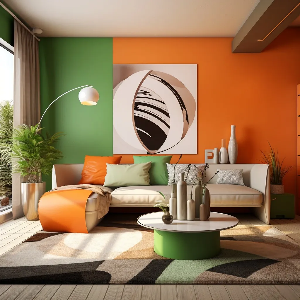
Orange Wall Colour Combination Ideas For Living Rooms
Living rooms handle orange differently from bedrooms. The colour becomes far more visible here because the space already carries more objects, more lighting layers and more movement through the day. A bright orange wall behind the sofa may look energetic in daylight, then start reflecting too much warmth by evening once lamps and ceiling lights come on.
That is why softer shades tend to work better for a long-term orange colour combination living room setup. Burnt orange, muted terracotta and clay tones bring warmth without making the room feel loud from every corner.
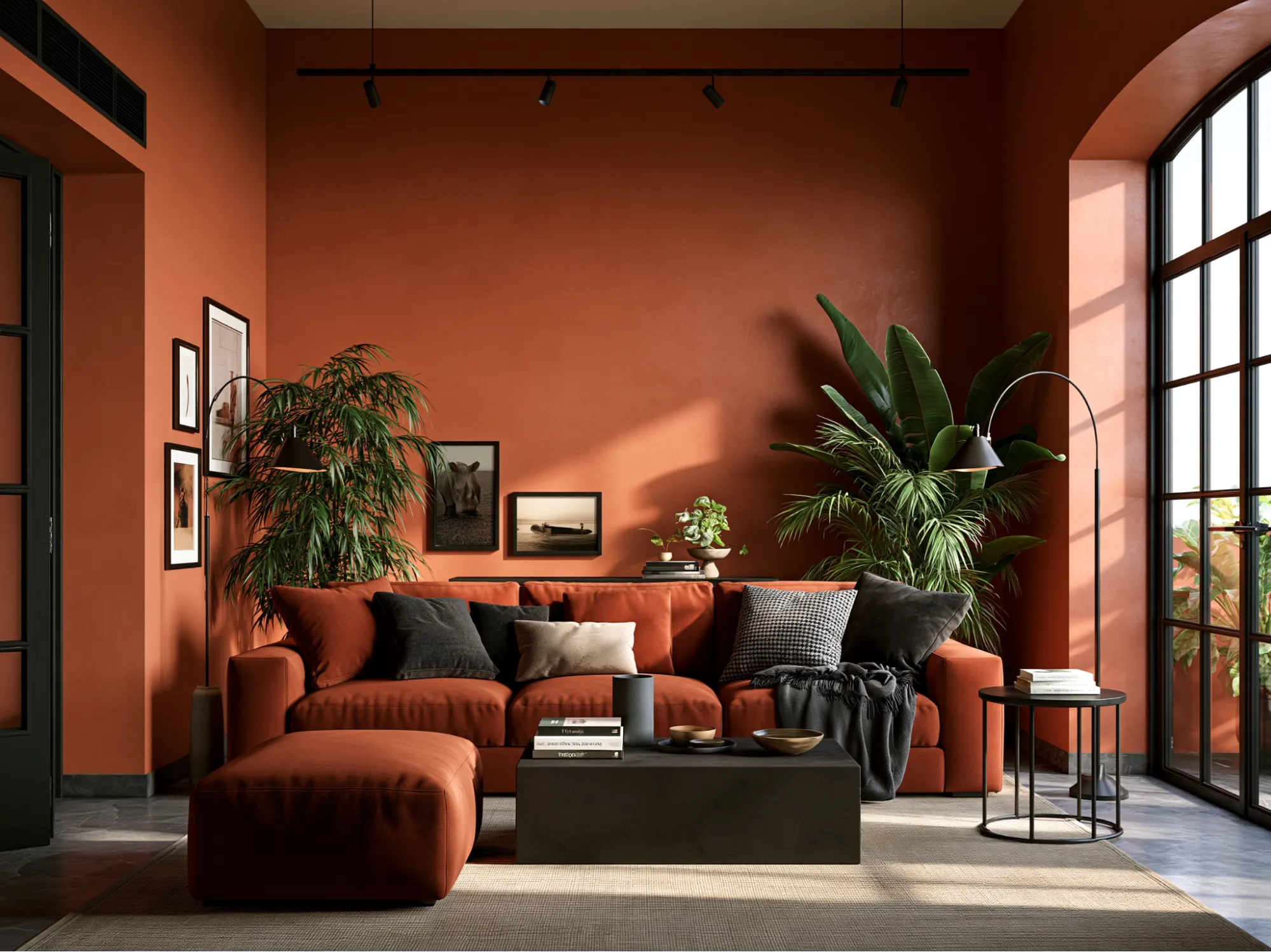
Burnt Orange With Cream And Wood Tones

Burnt orange walls beside cream sofas and walnut furniture feel grounded very quickly. The cream breaks the density of the wall colour, while the wood keeps the room from feeling flat. This kind of colour combination with an orange wall also works well in homes that already have beige flooring or warmer lighting.
Peach Orange With Off-White Interiors

Peach orange changes the mood completely. The room feels lighter, softer and more open, especially during the daytime. Off-white curtains, lighter oak furniture and textured fabrics help the colour settle naturally inside the space instead of pulling all the attention towards the wall itself.
Grey And Orange For Modern Living Rooms

Grey sharpens orange more than most people expect. A charcoal sofa against a muted orange wall immediately creates contrast, especially with black metal lighting or matte surfaces nearby. In smaller living rooms, lighter grey tones feel easier because dark grey and dark orange together can make the room feel visually packed at night.
Olive Green And Rust Orange Living Rooms

Rust orange and olive green carry similar earthy depth, so the pairing feels connected instead of contrasting too hard. Textured cushions, woven rugs and softer lighting make this combination feel calmer than brighter orange interiors. It also sits naturally inside living room colour combinations inspired by earthy or slightly rustic spaces.
Black Accents With Orange Walls

Black works best here in smaller portions. Thin frames, pendant lights or side tables create enough contrast without overpowering the wall colour itself. Too many black surfaces beside dark orange walls can make the living room feel tighter than it actually is, particularly in apartments with limited daylight. A balanced orange colour scheme for living room setup depends less on making orange stand out and more on controlling how much visual weight already exists across the room.
The White Canvas With Orange Colour Is The Perfect Mix of Harmony

White and orange together create a clean, modern look that feels both bright and spacious. White, being a neutral canvas, allows the vibrancy of orange to stand out, highlighting its energy without overwhelming the senses. This combination is perfect for minimalist designs where the goal is to have a pop of colour without clutter. In fashion, white brings out the playfulness of orange, while in interior design, it adds a fresh, citrus-like zest, reminiscent of summer days and lively gatherings.
The Subtle Balance Of Grey And Orange

It is one of those colours that subtly match with orange. Grey, in its myriad shades, acts as a subtle balancer for the vivacity of orange. It provides a sophisticated backdrop that enhances the warmth of orange without competing for attention. Lighter greys work well in creating a soft, approachable look, while darker greys offer a more dramatic and contemporary feel. This colour pairing is ideal for spaces and outfits that aim for an understated elegance, where orange adds a hint of warmth and personality amidst the neutral tones of grey.
You may also like!
| Brown Color Combination | Brown Colour Combination Paint Ideas for Wall |
| Grey Master Bedroom Ideas | Master Bedroom Design with Grey Colour Ideas |
| Grey Colour Combination | Gray Colour Combination Paint Ideas for Wall |
| Hall Painting Designs | Unique and Simple Hallway Paint Design Ideas |
The Natural Companion Green
Green, a colour often associated with nature and growth, pairs beautifully with orange, reminiscent of autumn leaves against evergreen trees. This colour combination of orange brings a sense of earthiness and vitality, perfect for spaces that aim to evoke a natural, organic feel. Lighter greens like sage or mint offer a more subdued look, while deeper greens like emerald or olive provide a rich, luxurious contrast.
The Bold Black And Orange Is Class

Black and orange together make a bold and dramatic colour combination of orange. The depth of black intensifies the brightness of orange, creating a striking contrast that is both elegant and daring. This combination is often associated with contemporary design and high-impact visual art. In fashion, it conveys sophistication and confidence, while in interiors, it can create focal points that are both captivating and stylish. This pairing is perfect for those looking to make a strong visual impact, balancing the audacity of orange with the timeless strength of black.
The Royal Contrast of Purple With Orange

Purple, especially in its deeper shades like plum or eggplant, offers a royal and luxurious contrast to orange. This combination is bold and dramatic, exuding a sense of richness and depth. Lighter purples, like lavender, bring a softer, more whimsical contrast, ideal for creating a space or outfit that feels both cosy and sophisticated. In both cases, the contrast between the warm orange and the cool purple creates a dynamic and visually compelling palette.
The Luxurious Orange And Shiny Gold

Gold and orange together create a luxurious and warm colour palette of orange, leading to autumnal richness and opulent sunsets. This combination brings a sense of elegance and sophistication, with gold adding a shimmering, upscale quality to the warmth of orange. It's particularly effective in adding a touch of glamour to fashion accessories or in interior design elements where a hint of opulence is desired. The reflective quality of gold enhances the depth of the orange, making this pairing ideal for festive occasions and luxurious spaces.
The Soft Whisper of Cream With Orange

Cream, a soft and muted variation of white, pairs beautifully with orange to create a look that's understated yet warm. This combination is like a gentle whisper compared to the shout of more vibrant pairings, offering a soothing and comfortable vibe. It’s perfect for spaces that aim for a cosy, welcoming atmosphere, or for fashion where subtlety is key. The creamy tones downplay the intensity of orange, resulting in a harmonious, soft, and approachable palette.
The Earthy Connection of Brown And Orange

Brown, in its various shades from light beige to dark chocolate, creates an earthy and grounded pairing with an orange colour combination. This combination brings to mind the natural elements of wood and soil, evoking a sense of stability and warmth. Darker browns offer a robust and sturdy contrast, while lighter shades like tan or beige provide a softer, more neutral backdrop. In both fashion and interior design, this pairing can create an environment that feels both comforting and connected to nature.
The Delicate Contrast of Lavender With Orange

Lavender, a soft and dreamy hue, offers a delicate and refreshing contrast to the vibrant energy of orange. This pairing brings a sense of whimsy and lightness, reminiscent of a serene sunset or a blooming spring garden. The coolness of lavender balances the warmth of the orange colour palette, creating a harmonious and aesthetically pleasing palette. This combination is perfect for spaces seeking a touch of romance and peace, or for fashion ensembles that aim to be softly colourful yet striking.
The Majestic Cobalt Blue And Orange

Cobalt blue, with its intense character, provides a bold and dynamic complement to orange. This striking contrast is reminiscent of the vividness of Mediterranean landscapes, where bright skies meet vibrant landscapes. The richness of cobalt blue deepens the impact of orange, creating a palette that is both energetic and sophisticated. In interior design, this pairing can make a strong visual statement, while in fashion, it offers a confident and stylish look.
The Subdued Harmony of Olive Green Clubbed With Orange

Olive green, a muted and earthy tone, pairs with orange to create a subdued yet harmonious look. This combination is grounded and natural, evoking the colours of autumn and the rustic outdoors. Olive green's understated quality allows the vibrancy of orange to shine without overpowering it. This pairing is ideal for creating spaces that feel organic and balanced, or for fashion choices that blend vibrancy with earthiness.
You may also like!
| Light Green Colour Combination | Trendy Light Green Colour Combinations for Home |
| Light Wall Paint Color For Room | Amazing Light Wall Color Combination for Every Room |
| Living Room Color Palettes | Colour Palettes for Beautiful Living Room Walls |
| Living Room Paint Colors | Best Living Room Paint Color Design and Ideas |
The Vibrant Contrast of Magenta And Orange

Magenta, a deep and vibrant hue, offers a lively and intense contrast to orange. This combination is bold and eye-catching. The richness of magenta amplifies the vibrancy of orange, creating a palette that is unapologetically bright and spirited. In both interior design and fashion, this pairing is perfect for those looking to make a statement and stand out from the crowd.
Orange Two Colour Combination For Bedroom Walls
Bedrooms respond to orange very differently from living rooms. Stronger shades stay visually active for longer here, especially once the main lights go off and only warmer lamps remain. That is why softer orange tones feel easier inside sleeping spaces.
Muted Orange And White Walls

White cuts through the warmth of muted orange very quickly. Even one orange wall beside white surroundings changes the mood of the bedroom without shrinking the space visually. In smaller apartments, this pairing feels cleaner than darker orange shades spread across multiple walls.
Terracotta And Olive Green Bedrooms

Terracotta and olive green create a deeper palette, though the room needs enough lighter surfaces nearby to stop the colours from becoming too dense together. Cream bedding, textured curtains and softer lighting help here. Matte walls also make a visible difference because glossy terracotta starts reflecting too much warmth at night.
Light Orange Colour Combination For Smaller Bedrooms

A softer light orange colour combination with pale beige, sage green or off-white walls feels calmer than bright citrus shades inside bedrooms. Morning daylight softens peach and faded apricot tones even more, which is probably why these colours appear so often in modern bedroom design ideas and quieter bedroom wall colour combination setups.
Light Orange vs Dark Orange Colour Combination
Light and dark orange do not behave like stronger and softer versions of the same colour. They change the entire mood of a room differently.
When Light Orange Works Better

A softer light orange colour combination feels easier inside compact bedrooms and smaller apartments because the walls continue reflecting natural light through most of the day. Peach walls beside off-white curtains or pale beige furniture keep the room from feeling visually packed. Sage green also works as a softer light orange contrast colour, especially in bedrooms with lighter wood and textured fabrics nearby.
Where Dark Orange Looks Best

Burnt orange and terracotta feel heavier from the beginning, which is why they suit larger living rooms and dining areas better than tighter spaces. A deeper rust orange colour combination beside walnut wood, beige upholstery and matte textures, creates warmth without making the room look flat. Darker shades also hold their depth much better under softer lighting than brighter citrus orange walls.
Mistakes To Avoid With Dark Orange Walls
The biggest mistake with darker shades is adding too much visual weight around them at the same time. Dark flooring, bulky furniture and glossy walls together can make the entire room feel dense by evening. Instead of forcing a sharp contrast colour of orange, lighter textures and softer fabrics balance the walls more naturally. The best combination with orange colour often comes from reducing heaviness around the room rather than increasing contrast further.
Colours That Match With Orange According To Interior Style
The same orange shade shifts quite a bit once the style of the room changes. Peach walls inside a minimal apartment do not feel the same as terracotta walls surrounded by dark wood and layered fabric. The colour stays the same. The room around it does not.
Orange In Scandinavian Interiors

Orange feels lighter inside Scandinavian interiors because these spaces already leave a lot of visual breathing room. Pale oak furniture, off-white walls and softer daylight stop peach and muted clay shades from becoming too warm too quickly. Even small touches of orange stand out here. A rust-toned chair or faded orange cushion often becomes enough.
Orange In Earthy Indian Homes

Terracotta walls already feel comfortable beside cane furniture, woven textures and walnut wood. In many Indian homes, beige flooring and warmer lighting pull orange into a softer direction by evening instead of making it look brighter. This is also where earthy home decor ideas with linen fabric, clay decor and matte finishes start fitting naturally around the walls.
Orange In Minimal Modern Interiors

Minimal spaces leave very little to hide behind, so stronger orange shades become noticeable immediately. One muted orange wall beside softer neutrals feels cleaner than filling the entire room with colour. Textured surfaces also help here. Flat glossy orange walls inside minimal spaces can start looking too sharp under artificial lighting, especially in compact apartments using modern wall paint designs with darker furniture.
Orange With Textured Walls And Natural Materials
Texture breaks the flatness of the orange very quickly. Rough plaster, limewash finishes and softer wall texture designs stop darker shades from looking too solid across large walls. Linen curtains, stone surfaces and slightly uneven wood grains also change the way orange feels through the room, especially once natural daylight starts fading in the evening.
Finding The Right Balance With Orange Interiors
A good orange colour combination rarely depends only on the wall shade itself. In many homes, the bigger difference comes from the surfaces around it. Soft fabrics, muted lighting, lighter wood finishes and textured walls change the way orange settles into a room through the day. A deeper orange wall colour combination may feel calm in one space and far too heavy in another, simply because the flooring, furniture or lighting behaves differently around it.
At Interior Company, this becomes noticeable quite early while planning colour palettes for modern homes and compact apartments. Some rooms carry darker rust and terracotta shades comfortably. Others feel better with a softer light orange colour combination and lighter contrast around the walls. The balance often comes from smaller details that people notice only after the room starts coming together. Curtain texture, ceiling light warmth, matte finishes, furniture depth and even the amount of daylight entering the room by evening all start changing how orange finally looks inside the space.
*Images used are for illustration purposes only. Interior Company does not hold any copyright to the images unless mentioned explicitly.*
Wall Paint Design Ideas for You
- Theme
- Color
- Room Type
Ready for a home transformation?
Let our designers assist you!
Recent Posts


Absolutely! Orange is versatile enough for all seasons. Pair it with pastels for spring, bright tones for summer, earthy shades for autumn, and deep hues like navy or black for winter.
In rooms with limited natural light, use lighter shades of orange in combination with reflective surfaces like mirrors or metallics to brighten the space.
Most orange shades react quickly to warm lighting. Peach walls may start looking more yellow after sunset, while terracotta walls feel darker and heavier. Glossy paint makes this even more noticeable.
Living rooms handle orange more easily than bedrooms. The colour blends into the space because there is already more furniture, lighting and movement around it. Bedrooms feel calmer with softer peach or muted clay shades instead of bright orange walls.
Wood furniture almost always works well with orange. Walnut, oak and cane finishes soften the colour naturally. Very shiny surfaces or too much black furniture can make the room feel harsher than expected.
Bright orange walls can. People often enjoy the colour at first, then realise the room feels too loud after a few months. Softer shades with lighter fabrics and muted textures feel much easier to live with long term.
Cream, beige and softer greens calm orange down quite a bit. Bright white can sometimes feel too sharp beside darker orange walls, especially at night when warm lights are on.
In a professional setting, neutral tones like grey, cream, and navy blue complement orange well, providing a balance between vibrancy and sophistication.
Related Category
- Bathroom
- Bedroom
- Kitchen
- Living Room
- Walls and Texture