- Design Ideas
- Cities
- Trends
- Guides
- Price Calculators
- Interior DesignersNEW
- Our Portfolio
- More
- Home
- Trends
- Furniture And Decor
- Paint And Color
- What Color Is Replacing Dark Green
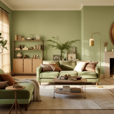
Lightening The Greens: Shifting From Darker to Softer Tones

A lot has changed in our lives in the past two years. And a lot is still changing. Our home interiors, just like every other part of our lives, are also witnessing a colourful evolution. It’s in the shades of the colours we prefer now. Green is the nature’s palette. It is the hallmark of harmony, so to speak, and has always been part of home interiors. The botanical and earthy character of the colour induces a sense of calm, comfort and renewal. The way we use green, however, is now changing. Darker shades of green, such as the hunters, the emeralds and the olives are being replaced by lighter ones, like the sage, turquoise and mint. More and more people now prefer softer tones of colour to symbolise a balanced and harmonious lifestyle.
Table of Content
We have multiple conversation starters now ' Is dark green out of style for 2026? If yes, How do you decorate with pale or bright green? And so on. The current shift reminds one of the Arts & Crafts Movement of the 1900s, where softer tones of green were being purposefully used in interiors. In a modern ode to the same, we look at the best ways to use light green in modern spaces and get the leisurely living going.
Why The Shift?
The transition from richer shades of dark green to calmer shades of bright green can be attributed to a need for a more relaxed and reassuring way of life post-pandemic. Think about it! Darker greens are rich in texture and dense in appearance. The visual warmth exuded by these shades has time and again been used for plush and luxurious settings. This intensity, however posh and premium, also evokes a sense of confinement. A sort of urgency, crispness and sharpness.
In contrast, the lighter shades of green make the rooms appear more spacious and airy. They induce a sense of calm, comfort and lightness in a space. With light green, there’s greater room to breathe, a calmer way to be and always a pleasant sight to behold. In comparison to the intensity, warmth and depth of dark green, light green symbolises freshness, calm and most important of all, growth.
This transition to a gentler way of life is expressed through a shift from the darker hues of green to the softer ones.
How to Use Light Green in Home Interiors
The psychology of colour schemes is alright, but how do you decorate with pale or bright green? Well, the first response to that is the thumb rule of interior design: personal preference. There are multiple hues of light green, such as the sage, the mint, the turquoise and others. These can be used according to one’s preference and personality to bring out the best in a space. Here are some of our favourite ways to use bright green as a replacement of dark green colour.
You may also like!
| Purple Colour Combination | Gorgeous Purple Wall Colour Combination Ideas |
| Green and Grey Colour Combination | Best Green and Grey Combination for Your Home |
| Green and Yellow Colour Combination | Green-Yellow Color Combinations for Home |
| Green Colour Combination | Stylish Green Wall Colour Combination Ideas |
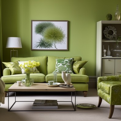
Sage Green for Mindfulness
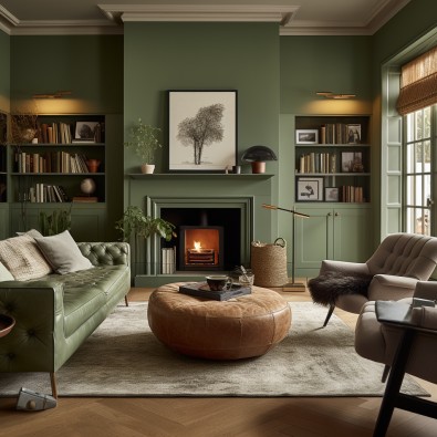
This graceful, versatile and sagacious shade of green is the perfect choice to create a mindful ambience in your home. As a base colour, we suggest using it for rooms intended for relaxation, such as the bedrooms and the living room. As an accent hue, sage green can evoke a sense of orderliness when used in tiles and accessories for kitchens and bathrooms.
The muted character of sage green allows it to pair well with a variety of other shades. Blending it white or cream is one of the most popular choices. Neutral tones like beige and grey also work well with it to create soothing atmospheres. A softer lavender, however, is a unique pairing and can make for extremely uplifting interiors.
Playful & Bright Turquoise
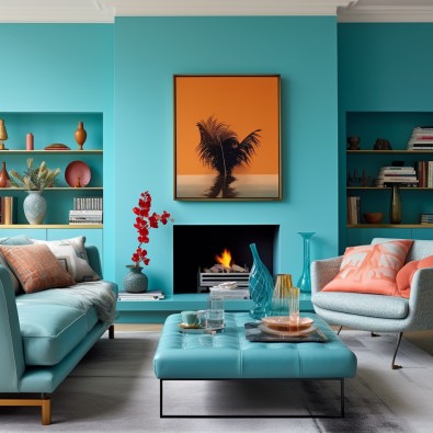
The primary reason why Turquoise is associated with relaxation is its tropical character. It is perfect for those looking to balance the dark and pale greens at once. The coastal hues of the colour naturally evoke a sense of escapism. For sea lovers who love a tinge of Mediterranean in everything, it's a great choice.
Turquoise can be artfully used to be stimulating without being overwhelming. Neutral tones work best with it to create bright yet calming interiors. Using earthy tones like brown along with turquoise can also bring balance and warmth to a space. For spaces where a darker ambience might be needed, such as a home office or study, turquoise can be paired with richer shades like navy or grey.
Soothing Mint Green
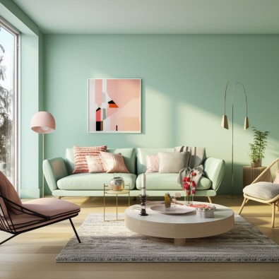
One of the best replacements of dark green colour is the mint green. Mint green is much like the first hints of spring. It’s fresh, airy, light and energetic. Thus, it fits beautifully in the interiors of a newly purchased home or a freshly renovated space. Mint green elegantly carries a modern character while being subtle and soothing.
Softer tones of white, beige and light grey pair the best with this colour. They create cohesive and balanced interiors. The colour combinations can be played along through the main walls, accessories, tilings and other parts of the room.
Pastel Shades of Pistachio Green
Pistachio green is another intelligent colour choice when it comes to infusing light greens into your interiors. This gentle hue is reminiscent of the pale green found in pistachio nuts and is known for its restful aesthetics. It's cheerful but not loud, bright but not overpowering. Using it on walls and accents with other colours can make for interesting designs.
Pistachio green pairs well with earth tones like warm brown and creamy whites. Otherwise, pastel shades of lavender and soft yellow can also create a whimsical ambience. This shade of green carries immense versatility, not just in its pairing with other shades, but also in its flexibility of usage. Pistachio as a replacement for dark green colour can be effortlessly used as both, the base and the accent colour.
Don’t miss out: Latest Green Wall Paint Design Ideas that Enhance Your Home Aesthetics
Astounding Apple Green
Apple Green infuses a space with a certain sense of liveliness. Like all other shades of light green, the colour mildly leaves its impressions and brings unparalleled intimacy to your interiors. Several combinations can be paired up, depending on the desired aesthetic goal of your makeover. For neutral effects, white, cream and beige are wonderful pairings. For vibrant combinations, apple green can be used along with shades of orange to add the desired punch. For those looking to add earthy colours to their homes, using apple green with terracotta is also an interesting choice.
You may also like!
| Flat Paint Ideas | Beautiful Paint Design Ideas for Your Flat |
| PU Paint and Polish | PU Wood Polish and Paints for Interior Wood |
| Ash Colour Combination | Trendy Ash Colour Combinations for Your Home |
| Study Room Colour Combination | Beautiful Colour Combinations For Study Room |
Greens There Were, Greens There Will Be
Home styling has never been devoid of the greens. From design choices like wall colours to decorative elements like houseplants, green reminds us of our innate connection to nature. The gradual shift from rich, dark greens to softer, lighter shades reflects our collective desire for a balanced, tranquil, and calmer lifestyle. It’s time to embrace the change and create homes that are not only aesthetically pleasing but also soulfully enriching.
For more inspirational home decor ideas, Connect to our experts at Interior Company, curating designs with on-trend ideas that suit your taste and space.
*Images used are for illustration purposes only. Interior Company does not hold any copyright to the images unless mentioned explicitly.*
Wall Paint Design Ideas for You
- Theme
- Color
- Room Type
Ready for a home transformation?
Let our designers assist you!
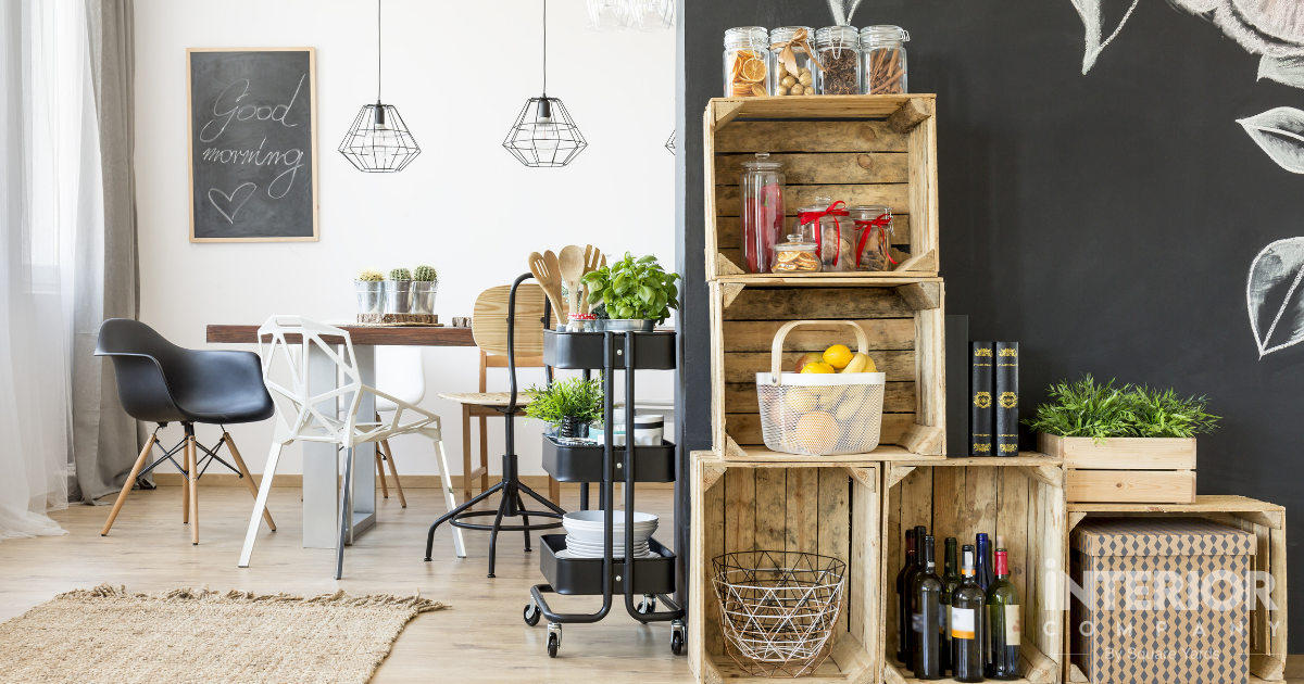
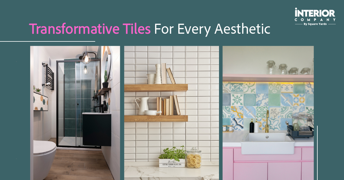
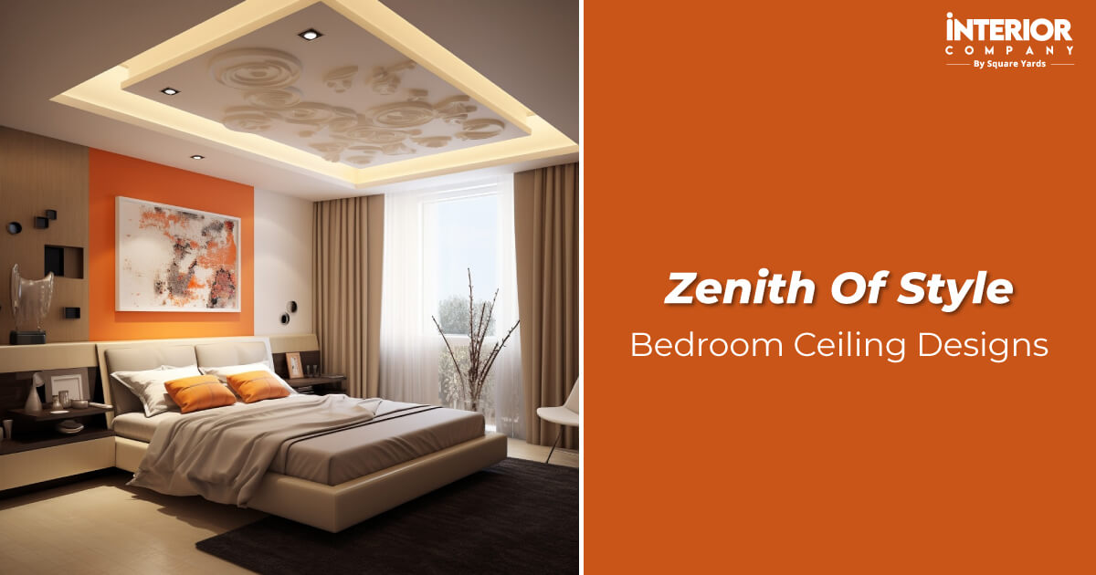
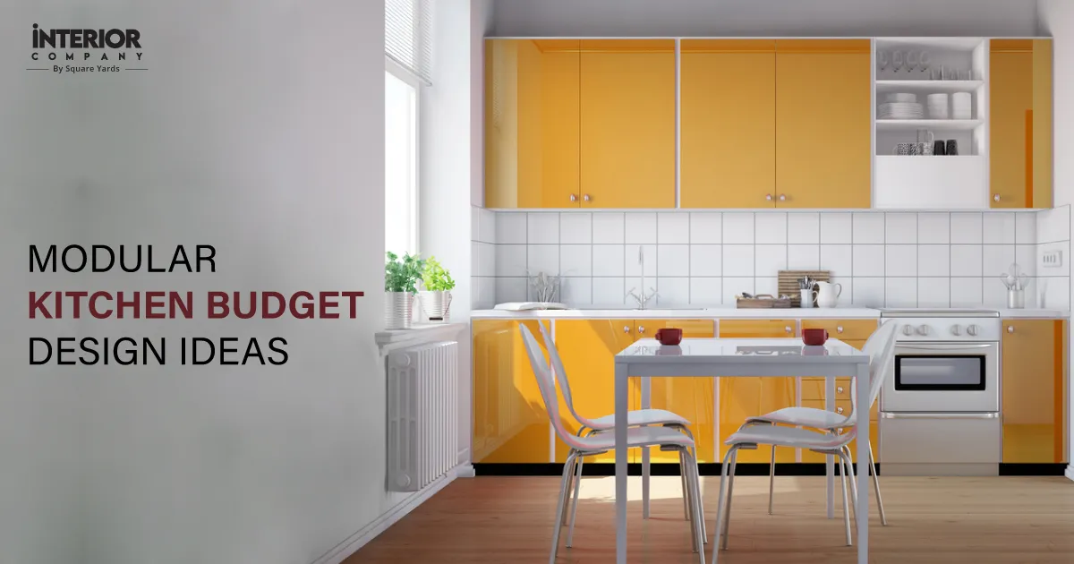
Recent Posts


Shades of green can be used in cushions, bedsheets and curtains to elevate the decor of a room. They can also be infused into tiles and other accessories for kitchens and bathrooms.
Shades of white, grey, beige and blue are popularly used with light green. However, colour combinations are highly subjective and depend upon one’s taste and preference.
Yes, light green can be used as a base colour. Replacing darker greens with lighter ones can help add a sense of lightness and airiness to the room. Symbolising comfort and relaxation, the colours fit best for bedrooms and living areas.
The choice of a shade depends upon the mood and ambience you seek for a particular room. For muted shades, you can prefer pistachio green. While for slightly punchy interiors, you can experiment with turquoise. Various other shades of light greens can also be experimented with.
Related Category
- Bathroom
- Bedroom
- Kitchen
- Living Room
- Walls and Texture