- Design Ideas
- Cities
- Trends
- Guides
- Price Calculators
- Interior DesignersNEW
- Our Portfolio
- More


- Home
- Trends
- Furniture And Decor
- Paint And Color
- Light Wall Paint Color For Room
15+ Best Light Colour For Wall: Classic Options For Bright And Comfortable Homes

Wall colours stick around longer than expected. A sofa can be replaced. Curtains can be changed. Even the furniture can be upgraded after a few years. But walls are different. Once they’re painted, most people don’t want to change them really soon. That’s why choosing a wall colour feels more complicated than it should.
Most people choose wall colours from a paint catalog that don’t really show how a colour will look across an entire room. A soft white may look warm in one house and slightly grey in another. Beige can feel rich and cozy in a living room but look flat in a space that barely gets any sunlight. The colour itself hasn’t changed. The room around it has.
Table of Content
This is where lighter shades tend to have an advantage. They leave more room for adjustment later. Different furniture styles, changing decor, new flooring and even a different lighting setup. Most light shades handle these changes without creating fresh problems.
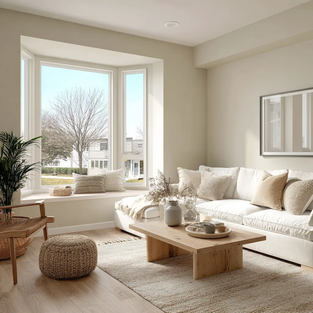
Let’s take a closer look at why light colours for walls work so well and which shades are worth considering.
Why Light Wall Colours Continue To Be A Favorite?
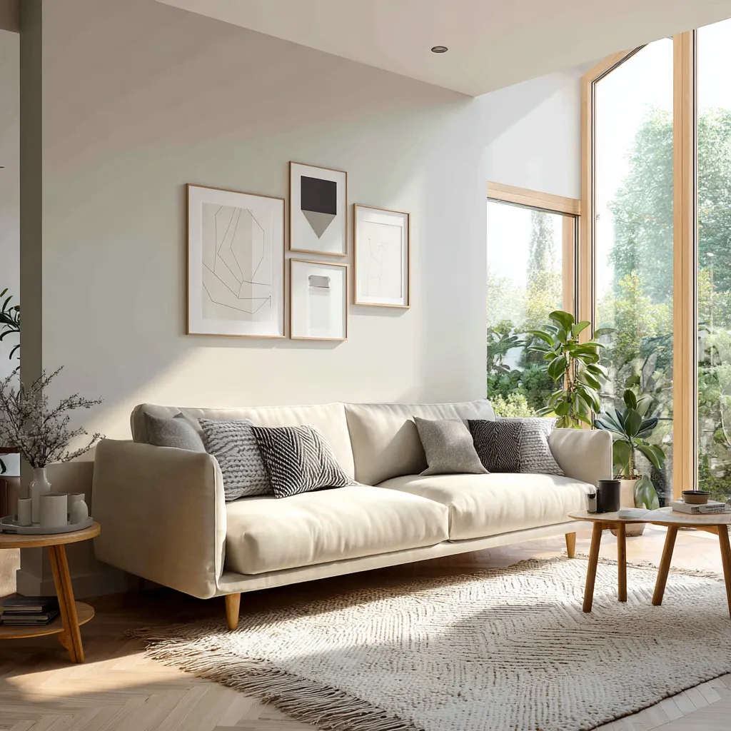
There’s no shortage of colour trends. Every year brings a new favorite. Deep green walls, earthy browns, dramatic blues and warm terracottas. Some of them look fantastic. The question is whether they still feel right after a few years.
Lighter shades have a different job. Instead of becoming the center of attention, they support everything else in the room. Artwork becomes more noticeable. Furniture has a bit more presence. Decorative pieces don’t have to compete with the walls. That matters more in the long run.
A wall colour covers a large part of the room. If it demands attention all the time, the space can start feeling busier than intended. Light shades avoid that problem. They allow other elements to shine. They also tend to work across different design styles. A cream wall can sit comfortably in a traditional home. A soft white can work in a minimalist apartment. Light grey can fit into a modern interior without much effort.
That’s one reason a light colour for walls remains such a common choice. It gives homeowners more flexibility, both now and later.
You may also like!
| Turquoise Colour Combination | Best Turquoise Colour Combination for Wall |
| Living Room Colour Combination | Two-Colour Combination Ideas for Living Room |
| Types of Paints and Finishes | Know about Different Types of Wall Paint and Finishes |
| Enamel Paint | Best Enamel Paints for Wood and Metal |
Best Light Colour Shades For Walls
Not all light shades create the same effect. Some feel warm and cozy. Some of them feel soothing and comforting to the eyes. Others sit somewhere in between.
That’s what makes choosing a wall paint colour complicated. A shade that feels perfect in the store or paint catalog can feel completely different in your room. The colours below continue to appear in homes because they adapt well to different rooms and styles.
White
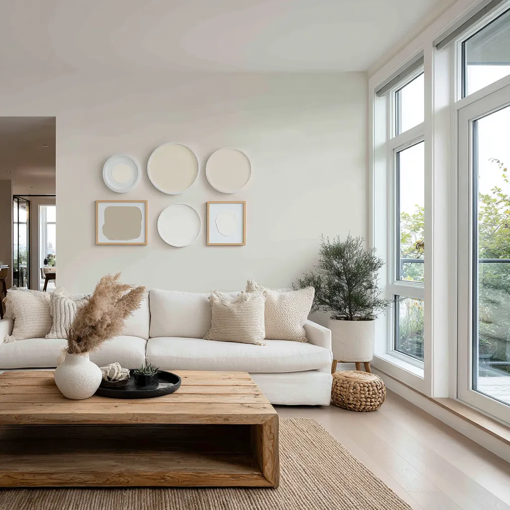
Most people don’t realize how many whites exist until they start comparing samples. At first, the differences seem tiny. Then the paint goes on the wall. One white suddenly looks creamy. Another starts looking slightly grey. A third appears much brighter than expected.
Choosing white is rarely as simple as it sounds. Two shades can look almost identical on a paint card and completely different on the wall. One may look slightly grey, another a little creamier. Daylight changes things too, which is why the same white can look right in one room and feel off in another.
White also survives changing trends better than most colours. You can change anything in the room, be it a rug or furniture. But the wall colour rarely becomes a problem.
Cream
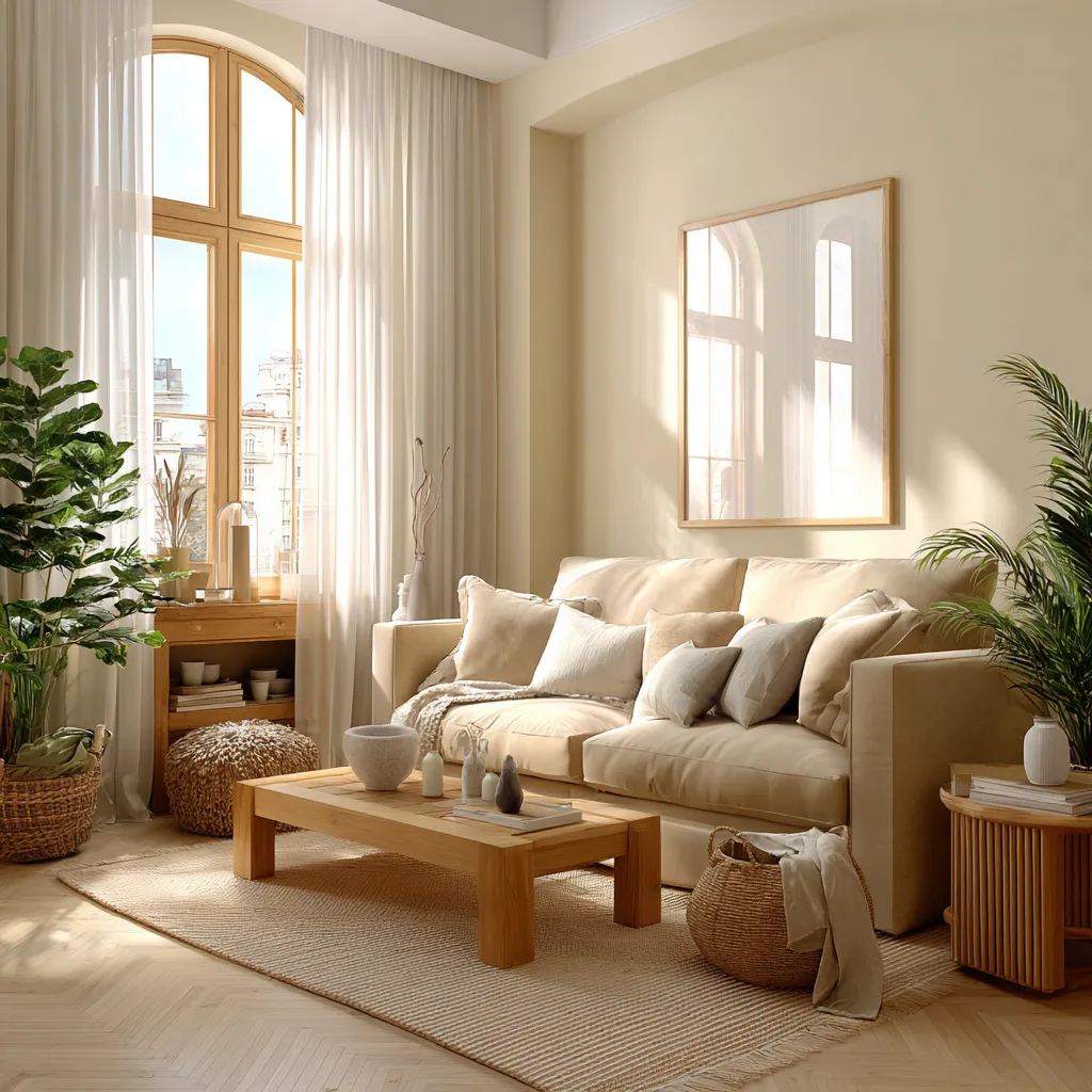
Cream usually gets considered after white. On a paint card, the difference can seem pretty small. Once it’s on the wall, the colour difference stands out more. The room still feels light, but the colour has a bit more warmth.
That’s why cream is used so commonly in bedrooms and living rooms. It’s also a shade that doesn’t ask much from the rest of the room. It goes easily with wood, neutral fabrics, and warm lights. Most of it tends to work together without much planning.
Beige
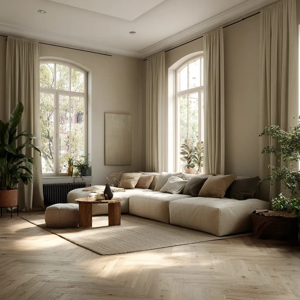
Beige has gone through phases. It was everywhere for a while. Then grey took over. Now, beige seems to be making its way back into homes.
The reason is simple. Beige brings warmth without making a room feel darker. Beige feels more balanced compared to the spaces where bright white feels too stark. It also goes well with natural materials. Beige walls look amazing with wooden floors, linen curtains, and indoor plants.
Light Grey
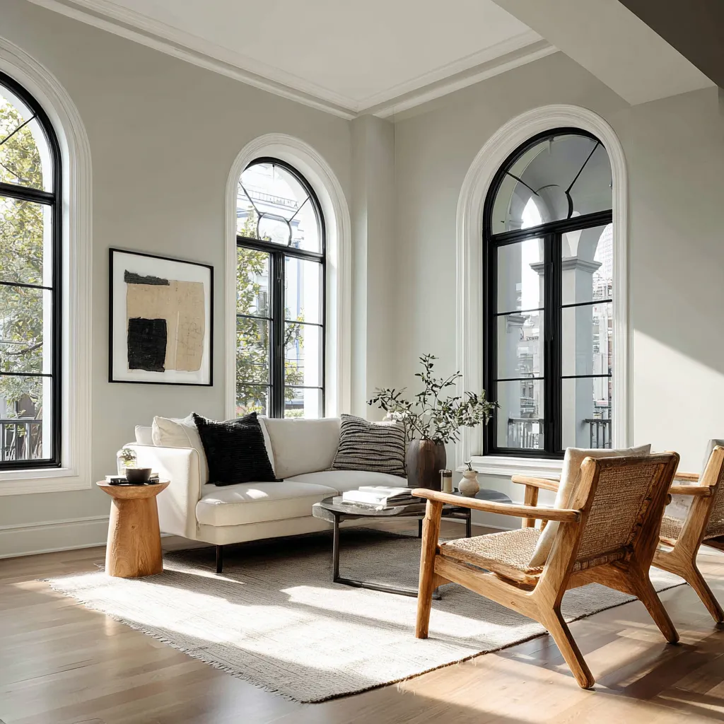
Grey walls aren’t as dark as they used to be. A few years ago, the deep grey colour was used everywhere. Now it’s mostly the lighter shades. They still give the room some contrast, but the walls don’t feel as heavy. White trims, wooden furniture and black handles. Light grey works comfortably with all of them.
Soft Pastels
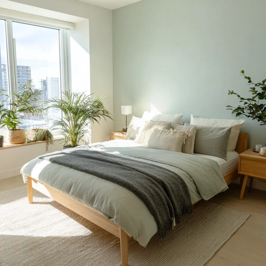
Not everyone wants a neutral wall. Soft pastels offer a middle ground. They add colour without taking over the room.
Some of the most common options include:
- Sage green
- Pale blue
- Dusty pink
- Soft lavender
- Muted peach
These shades work well in bedrooms, study rooms, and smaller living spaces where a little colour looks amazing but stronger shades might feel overwhelming.
Best Light Colour Combinations For Walls
It's easier to choose one colour than to choose two. The second colour is where people start questioning every decision.
What looks great in a showroom may not look the same in a real home. Lighting conditions change. Flooring affects how colours appear. Furniture introduces another layer entirely. That’s why many successful color combinations are surprisingly simple.
White And Beige
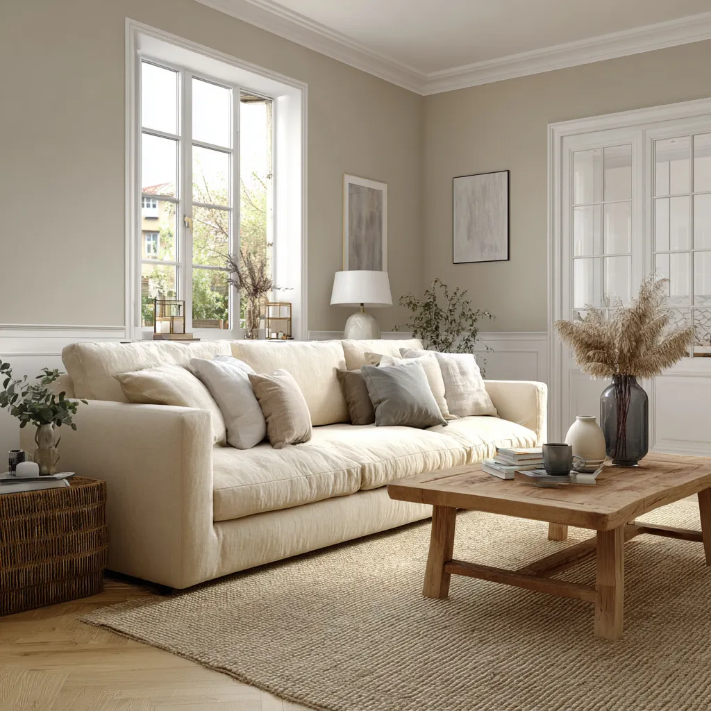
White and beige pair well because they solve different problems. White keeps the room bright. Beige softens the overall look of the room. This combination works in different room sizes and different furniture styles.
Grey And White
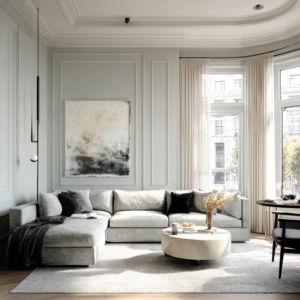
Grey and white are one of the most common combinations in modern homes. The contrast is visible without being dramatic. Grey adds depth while white keeps the room feeling open.
Cream And Brown
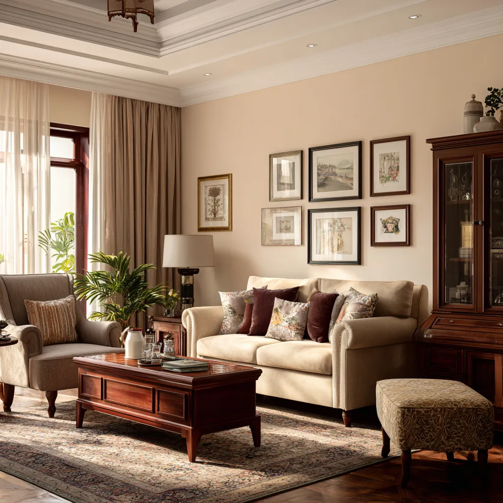
Cream walls and wooden furniture have worked together for years. The combination feels natural because neither colour competes with the other. The room feels warm without becoming dark, which makes it a popular choice for living rooms and bedrooms.
Soft Blue And White
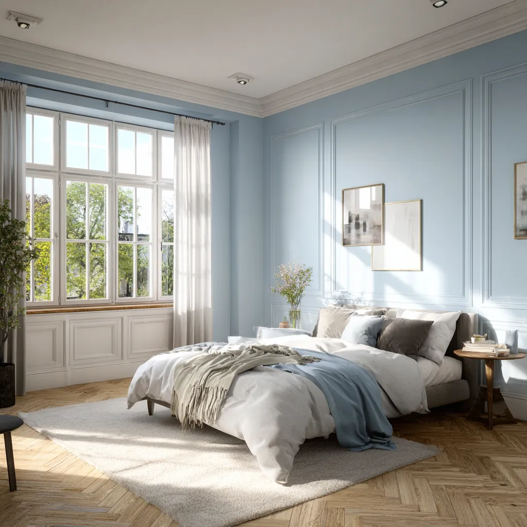
Soft blue walls paired with white details can make a room feel lighter without losing personality. The effect is subtle. The room still feels calm, but it doesn’t look entirely neutral.
Sage Green And Ivory
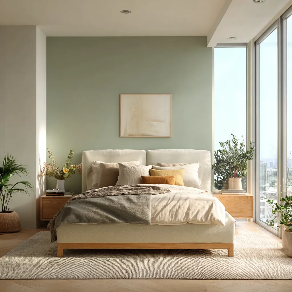
Sage green and ivory create a softer alternative to beige and white. The combination adds colour to the room, but in a restrained way. It's among the most popular colour combinations for modern bedrooms.
Light Shades That Work Well In Small Rooms
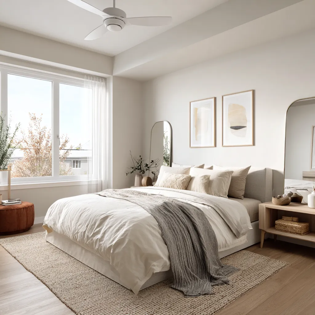
People start looking for wall colours that make a room look bigger when a room feels cramped or closed in. Sometimes it’s a small bedroom. Or a compact apartment living room. It can also be a narrow hallway that never gets enough light.
Paint can’t change the actual size of a room. A small room will still be a small room once the painting is done. What paint can change is how the room feels.
Dark colours draw attention to the edges of a space. Whereas lighter shades do the opposite. They soften corners, reflect available light, and reduce some of the visual weight that makes a room feel enclosed. That’s why lighter colours are recommended for compact spaces.
Some of the most popular choices include:
- Soft white
- Warm white
- Ivory
- Cream
- Pale beige
- Light grey
These shades are also among the paint colours that make a room look brighter, especially when natural light is limited.
The ceiling is really important. People usually think about wall colours. They forget that a dark ceiling can make a room feel tiny. A lighter ceiling helps keep a room feeling spacious. This doesn’t mean every small room has to be painted white. That’s not true. Soft beige, sage green or light grey can work great. They add a soft charm to the room.
Picking The Right Light Colour For Different Rooms
All rooms don’t behave the same way. A colour can look one way in the living room and another in the bedroom. Sometimes the difference is obvious, sometimes it isn’t. That’s why many people test colours in each room before making a final decision.
Living Room
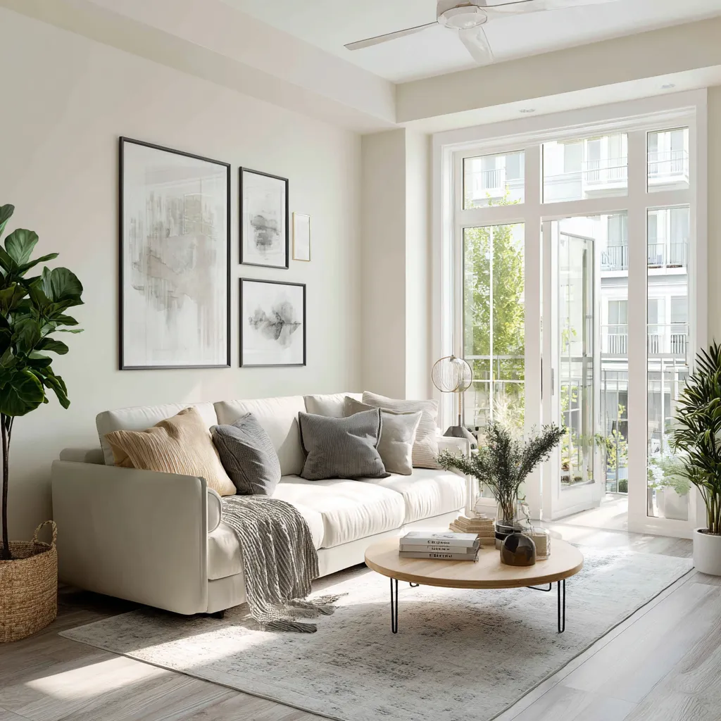
Living rooms usually have the most activity. Family gatherings, guests, movie nights, work calls. Everything tends to happen in this one space. That makes flexibility important.
Soft whites, creams, light greys, and warm beige shades are among the best light paint colours for living rooms because they work with different furniture styles and decor choices.
A living room rarely stays exactly the same for years. Rugs get replaced. Sofas change. New artwork appears on the walls. Light neutral shades adapt to those changes more easily than stronger colours. Many living room colour combination ideas start with a light neutral base for exactly that reason.
Bedroom
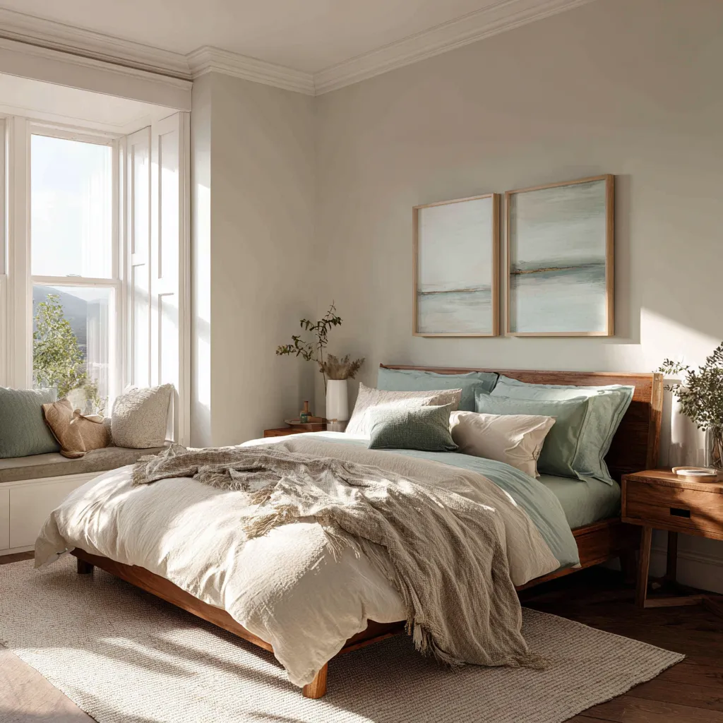
The bedroom should typically be a little softer than other rooms. Bright white can work in a master bedroom, but often people choose warmer colours because they tend to feel more at ease when going to sleep at night.
Cream, soft green, light blue and warm off-white are all popular light colours and give a bright and airy feeling without making a room overly bright.
Many of today’s bedroom painting schemes will have the above-mentioned colour scheme combined with natural wood bedroom furniture, neutral coloured bedding, and soft lighting.
Dining Room
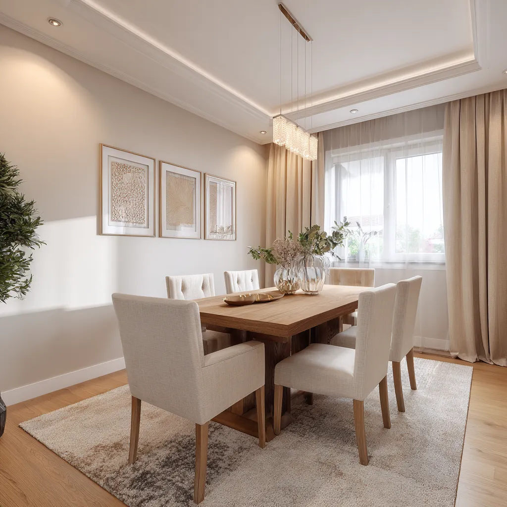
Dining rooms often receive less attention when people choose paint colours. That’s a mistake because lighting conditions in dining rooms can vary quite a bit. Some receive plenty of daylight. Others rely heavily on artificial lighting.
Warm neutrals usually work well here. Cream, beige, and warm white shades tend to create a comfortable setting without making the room feel dark.
Study Room
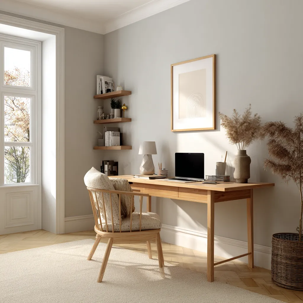
A study room doesn’t need dramatic colours. Most people spend enough time looking at screens already. Strong wall colours can sometimes become distracting. Soft white, light grey, and muted beige shades often work well because they create a clean backdrop without demanding attention.
Where People Go Wrong With Light Wall Colours?
Most colour mistakes happen long before the paint reaches the wall. The problem isn’t usually the colour itself. It’s how the colour was chosen.
Choosing A Shade From A Tiny Paint Card
Paint cards are useful, but they’re also misleading. A colour that looks perfect on a small sample can behave very differently when it’s covering an entire wall. Undertones become more noticeable. Brightness levels change. The room itself starts influencing how the colour appears. That’s why paint samples are worth the extra effort.
Ignoring Natural Light
A paint colour can look very different depending on the room. Something that looks warm in a bright room may not look the same in a darker one. North-facing rooms are a good example. Colours often appear cooler there than people expect. This is why paint samples can be helpful before making a final decision.
Forgetting About Flooring
The wall colour isn’t the only thing people see in a room. Flooring affects how a colour looks too. Wooden floors, patterned tiles, and darker surfaces can all change the way a shade appears. Beige, for example, may look different next to oak flooring than it does beside grey tiles.
Following Trends Too Closely
A colour doesn’t have to be popular to work in a room. Plenty of shades look good in photos but don’t always suit every home. Lighting, furniture, flooring, and room size matter just as much. Sometimes the colour that works best is not the one that’s trending.
You may also like!
| Olive Green Colour Combination | Best Olive Green Combination Wall Paint Ideas |
| Paint Colours for Your Home | Latest Paint Colour Combinations for Your Home |
| Staircase Colour Ideas | Amazing Painted Staircase Ideas for Every Style |
| Cost of Painting a House | House Painting Rate Per Square Feet in India |
Choosing A Shade You’ll Be Happy With
Light wall colours are one of those choices that usually don’t cause many problems later. White, cream, beige, light grey and soft pastels. All of them can work. The main thing is to choose a shade that suits the room and the amount of light it gets. A colour that looks great in one house can look completely different in another.
If you’re planning to renovate your home and can’t decide between colours, Interior Company can help. Our team works with homeowners on everything, be it colour selection or complete interior design. The focus is on finding what works for your space instead of picking something just because it’s popular.
'Images used are for representational purposes only. Unless explicitly mentioned, the Interior Company does not hold any copyright to the images.'
Wall Paint Design Ideas for You
- Theme
- Color
- Room Type

Ready for a home transformation?
Let our designers assist you!
Recent Posts







There isn’t one colour that’s best for every home. A lot depends on the room. Some rooms get a lot of sunlight while others barely get any. That’s why colours like soft white, cream, beige, and light grey stay popular. They usually work without causing too many problems later.
Not actually bigger. The room stays the same size. But lighter colours reflect more light, so the space can feel a bit more open. Especially in smaller rooms where darker colours can sometimes make the walls feel closer.
Most people end up choosing warm white, cream, beige, or light grey. They’re easy to live with. If you change the sofa, rugs, or curtains later, these colours still tend to work. They just make things simpler.
Yes. They never really disappeared. White walls have been around forever and people still use them because they’re easy to decorate around. Trends change all the time, but white usually sticks around in one form or another.
Quite a lot, actually. Natural wood tones usually look good. Beige and brown accents work too if you want something warmer. Black fixtures can stand out nicely against light walls. Muted greens and soft blues are common choices as well. And neutral fabrics. There’s no fixed combination. It really depends on the style of the room.
Cream and warm white are probably the ones people use most. Pale blue, sage green, and muted grey are popular too. They keep the room feeling soft and don’t make it look dark.
They can be. The softer pastel shades are generally easier to work with than very bright ones. Sage green and pale blue are good examples. They add some colour without becoming the only thing you notice in the room.
Paint a sample section on the wall first. Then just leave it there and look at it during the day. Morning light can make it look one way, afternoon light another. Even the lights you use at night can change how the colour appears. It’s surprising sometimes. A colour that looked perfect in the store doesn’t always look the same once it’s on the wall at home.
Related Category
- Bathroom
- Bedroom
- Kitchen
- Living Room
- Walls and Texture